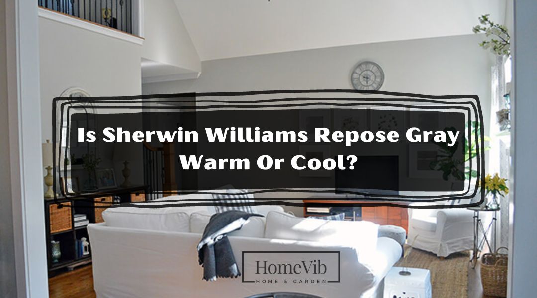
Sherwin Williams Repose Gray is considered a warm gray color. It has warm undertones with beige and taupe hints, making it a versatile and popular choice for interior and exterior spaces.
Remember that lighting and surrounding colors can affect how colors are perceived. Test a paint sample in your specific environment before deciding.
What Color Is Sherwin Williams Repose Gray?

Sherwin Williams Repose Gray is a highly sought-after color known for its versatility and timeless appeal. In this section, we will explore various aspects of Repose Gray to provide a comprehensive understanding of its characteristics and how it behaves in different environments.
From its warmth and undertones to its potential resemblance to blue and its perceived darkness, we’ll delve into the details to help you make informed decisions for your color schemes and design projects.
Is Sherwin Williams Repose Gray Warm Or Cool?
Sherwin Williams Repose Gray is categorized as a warm gray color. It strikes a delicate balance between warm and cool tones, leaning more towards warmth. This makes it an excellent choice for those seeking a neutral color with a touch of coziness.
Unlike cooler grays that appear stark or clinical, Repose Gray exudes a sense of inviting warmth and softness, creating a welcoming character in any space.
Does Repose Gray Look Blue?
One common question when considering Repose Gray is whether it has a bluish tint. While Repose Gray does not inherently possess a strong blue undertone, it can sometimes exhibit a slight hint of blue in certain lighting conditions.
This is known as a chameleon effect, where the color appears to adapt and reflect elements from its surroundings. However, the blue undertone in Repose Gray is generally quite subtle and is not a dominant characteristic of the color.
For instance, if Repose Gray is used in a room with cool natural light or cool-toned furnishings, it might enhance the perception of the blue undertone. Conversely, the blue undertone may appear less noticeable or nonexistent in a space with warm lighting or warmer-toned decor.
It’s crucial to consider the lighting and existing elements in your area when choosing Repose Gray to achieve the desired aesthetic effect.
What Is the Undertone Of Sherwin Williams Repose Gray?
The undertone of Sherwin Williams Repose Gray is predominantly a warm beige with subtle taupe undertones. These undertones contribute to the overall warmth of the color, making it an excellent choice for those seeking a cozy and inviting atmosphere.
The beige undertone ensures that Repose Gray doesn’t feel overly cool or sterile, while the touch of taupe adds depth and complexity, giving the color a sophisticated and versatile character.
It’s important to note that undertones can manifest differently depending on the lighting conditions and surrounding colors in a given space.
When considering Repose Gray, obtaining and observing a sample in various lighting conditions is advisable to gauge how the undertones interact with your specific environment. This will help determine if it aligns with your desired color scheme and aesthetic vision.
Is Repose Gray Too Dark?
Sherwin Williams Repose Gray is considered a mid-tone gray, falling somewhere in the middle of the spectrum between light and dark gray. This makes it an incredibly versatile shade that works well in larger and smaller spaces.
Repose Gray’s mid-tone nature allows it to create a balanced backdrop to highlight other elements in a room without overpowering them. It strikes a harmonious chord, making it suitable for various design styles, from contemporary to traditional.
The darkness or lightness of a color is subjective and dependent on personal preferences and the intended use of the paint.
However, it’s always advisable to test Repose Gray in your space to evaluate how it appears under your specific lighting conditions and alongside your existing furnishings and decor.
What Colors Go With Sherwin Williams Repose Gray?
When choosing colors that complement Sherwin Williams Repose Gray, numerous options can create stunning and harmonious color palettes.
Here are five colors from Benjamin Moore, Sherwin Williams, and Behr that go well with Repose Gray:
1. Behr Light French Gray
Light French Gray is a soft and muted gray with subtle lavender undertones that complement Repose Gray elegantly.
This pairing adds a touch of delicacy and sophistication to any space, making it suitable for bedrooms, nurseries, or even dining rooms.
Enhance the serene vibe by incorporating dusty rose or pale lavender hues accents.
2. Benjamin Moore Kendall Charcoal
Kendall Charcoal is a deep, rich gray contrasting sharply with Repose Gray. This combination is perfect for creating a dramatic focal point or adding depth to a room.
Consider using Kendall Charcoal for an accent wall or cabinetry in kitchens, bathrooms, or home offices, while Repose Gray can be used as a complementary color for the remaining walls.
3. Sherwin Williams Agreeable Gray
Agreeable Gray is a warm, greige color that pairs seamlessly with Repose Gray. This combination creates a versatile, timeless palette that works well in various design styles.
Use Agreeable Gray as the primary color for larger areas and Repose Gray for smaller accents or focal points to add depth and visual interest to the overall scheme.
4. Behr Muted Sage
Muted Sage is a soft, muted green-gray color that pairs beautifully with Repose Gray. This combination evokes a sense of tranquility and nature-inspired serenity.
Use Muted Sage as the main color for walls or more significant areas and incorporate Repose Gray through furniture, artwork, or decor accents for a cohesive and calming atmosphere.
5. Behr Polar Bear
Polar Bear is a crisp and bright white that creates a fresh and clean look when paired with Repose Gray. This combination is perfect for creating a coastal or Scandinavian-inspired style.
Use Polar Bear for ceilings, trim, or even cabinets, and Repose Gray for walls to create a bright and airy feel.
Which Is Better, Repose Gray Or Agreeable Gray?
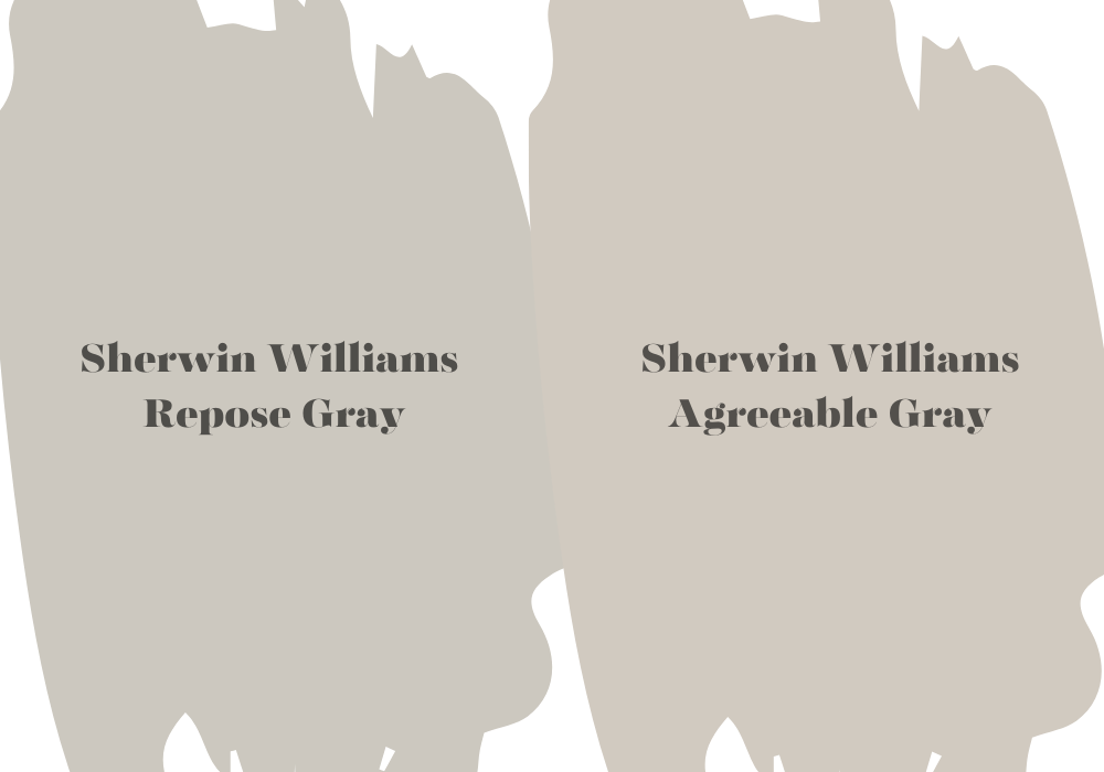
Both colors have unique characteristics and appeal, so it’s essential to consider your desired aesthetic, lighting conditions, and existing decor. When deciding between Repose Gray and Agreeable Gray, it’s essential to consider the factors influencing your decision.
Repose Gray is a warm gray color with beige and taupe undertones. It exudes warmth and coziness, creating a welcoming atmosphere in any room. Repose Gray is versatile and works well with various design styles, from traditional to contemporary.
Its mid-tone nature balances light and dark, making it suitable for larger and smaller spaces. If you prefer a color that leans more toward warmth and wants to create a cozy feeling, Repose Gray can be an excellent choice.
On the other hand, Agreeable Gray is a warm, greige color, meaning it combines gray with beige undertones. It has a neutral and soothing quality, making it a popular choice for many homeowners.
Agreeable Gray is slightly lighter and softer than Repose Gray, making it suitable for spaces requiring a more subtle and understated backdrop. It can adapt to different lighting conditions, appearing warm and cozy in some instances and cooler and crisper in others.
What Is Behr Paint Similar To Sherwin Williams Repose Gray?
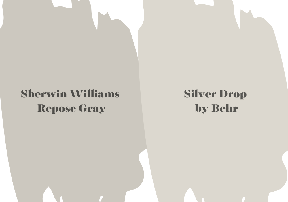
Silver Drop is a light gray with cool undertones, just like Repose Gray. It has a similar versatility and ability to create a soothing and neutral backdrop in various spaces.
While it’s important to note that there might be slight undertones and color intensity variations between different paint brands, Silver Drop is a popular choice for those seeking a color reminiscent of Repose Gray within the Behr paint line.
To ensure the best match, obtaining a sample of Silver Drop and comparing it to Repose Gray in your specific lighting conditions is always recommended before making a final decision.
What Is Lighter Than Sherwin Williams Repose Gray?
While Mindful Gray is lighter than Repose Gray, it maintains warmth and depth, creating a balanced and inviting atmosphere. It has a soft and subtle appearance, making it a popular choice for those who desire a lighter gray color for their space.
It can work well in various settings, from bedrooms to living rooms and even hallways. Remember that lighting conditions and other elements in your space can influence colors, so it’s always a good idea to test samples of different shades to find the perfect match for your needs.
What Benjamin Moore Color Is Closest To Sherwin Williams Repose Gray?
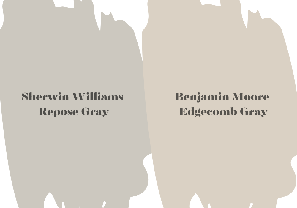
Edgecomb Gray shares characteristics with Repose Gray, making it a popular choice for those seeking a similar color in the Benjamin Moore paint line.
Edgecomb Gray is a warm gray with beige undertones, just like Repose Gray. It has a versatile, neutral appearance and works well in various spaces and design styles. This color has a subtle warmth and a soft, timeless quality that can create a calming and inviting atmosphere.
While Edgecomb Gray is a close match to Repose Gray, it’s important to remember that there may be slight undertones and color perception variations between different paint brands.
What Is The Difference Between Repose Gray And Light French Gray?
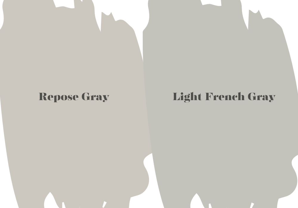
The main difference between Sherwin Williams Repose Gray and Sherwin Williams Light French Gray is their undertones and overall appearance. While both colors are within the gray family, they have distinct characteristics that set them apart.
Repose Gray is a warm gray color with subtle beige and taupe undertones. Its balanced blend of warm and cool tones gives it a versatile and timeless appeal. Repose Gray creates a cozy and inviting atmosphere in a space, making it a popular choice for those seeking a neutral yet warm backdrop.
On the other hand, Light French Gray leans more toward a cooler spectrum of grays. It has blue undertones that give it a hint of coolness. Light French Gray is a softer and more delicate shade than Repose Gray. It can create a serene and calming mood in a room, especially when paired with other cool-toned elements.
What Is The Difference Between Repose Gray And Crushed Ice?
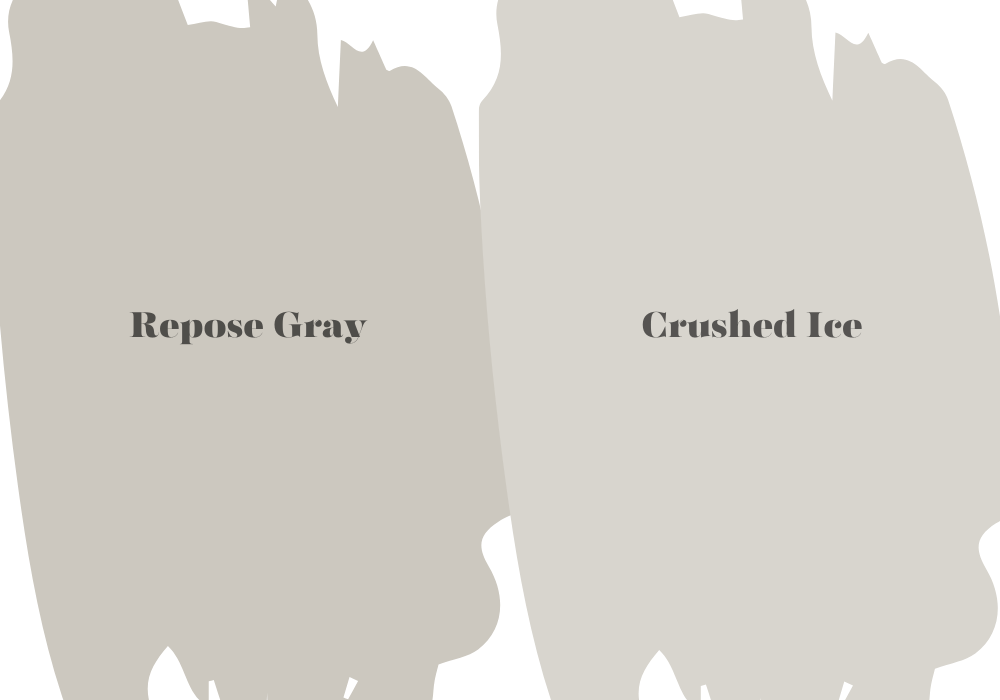
The contrast between Sherwin Williams Repose Gray and Sherwin Williams Crushed Ice is primarily evident in their undertones and overall visual presentation. Although both hues fall into the gray color category, they possess unique attributes that differentiate them.
The beauty of Repose Gray lies in its ability to infuse any space with a snug and welcoming environment, making it a highly sought-after option for those yearning for a neutral yet inviting setting.
Repose Gray, a delightful warm gray shade, boasts gentle hints of beige and taupe undertones. This harmonious blend of warm and cool tones grants it remarkable versatility and timeless allure.
In contrast, Crushed Ice veers towards the cooler end of the gray spectrum. Its subtle blue undertones lend it a distinctly crisp and cool appearance, setting it apart from Repose Gray.
With its fresh and icy essence, Crushed Ice brings a refreshing touch to any space, making it particularly suitable for those seeking a cooler and more classic ambiance.

