You’ve got a new house, and you’re trying to decide what color to paint it. What do you choose?
Well, you’ll probably go with a neutral shade if you’re like most people. Taupe is one of the most popular taupe paint colors out there—and for a good reason!
Neutral shades are always in style, and something about them makes them so easy to like.
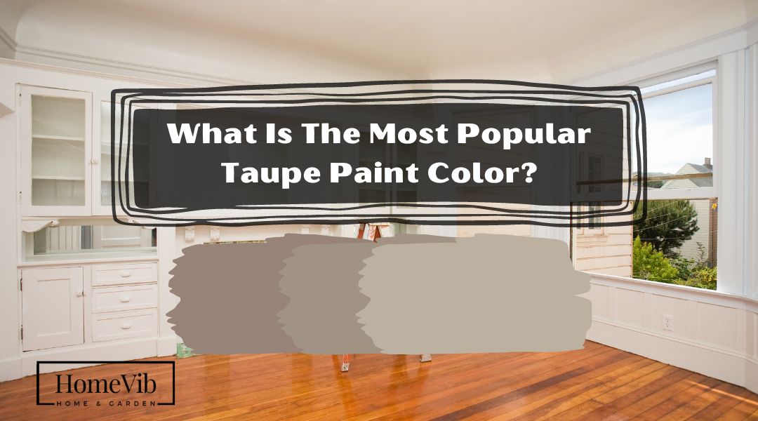
Taupe paint colors are very versatile. They’re perfect for larger spaces like kitchens and bathrooms and smaller rooms like closets and laundry rooms. If you want to go well with any decorating scheme, consider Taupe by choosing one of these popular taupe paint colors!
The most popular Taupe colors you can go for are Benjamin Moore’s shades. These include Driftwood, Weimaraner, and Pashmina. Kelly-Moore also has some of the best ones, namely Tranquil and Townhouse Taupe.
You can also choose from Sherwin-Williams’ Perfect Greige, Poised Taupe, and Gossamer Veil. Don’t forget Behr’s Smokestack and Creamy Mushroom on your list!
What Color Is Taupe?

Taupe is a neutral color that combines the qualities of dark brown and gray. Yet, designers apply Taupe to describe a wide range of colors. Not just one, and it can be anything from a dark tan to a brownish gray.
Historically, Taupe was originally derived from the French word for “mole.”
You may pair a purpler version of taupe with a yellow-green and a more saturated lime or yellow accent. You may pick a burgundy, pink, or deep crimson like a purple taupe.
Being a neutral tone, taupe could end up being the dominant shade. In that case, a beige taupe would subtly contrast with any blue shade. The same principle applies to any other orange tones.
Indeed, taupe is frequently used as a neutral in interior design. This shade is also a fantastic accent color that works well with various other colors.
10 Popular Taupe Paint Colors
These Taupe color selections are sure to spark new ideas for your home. Let’s look at everything possible!
1. Benjamin Moore’s Driftwood
Driftwood is a rich, versatile medium neutral with tan, taupe, and gray undertones.
Atrium White, Soft Satin, and White Diamond are all other BM paint colors that go well with it.
Oftentimes, it may look like a rock on the wall, depending on the angle of the light or the time of day. They change in appearance between a brownish and a grayish-brown tone.
2. Benjamin Moore’s Weimaraner
With its rich browns and grays, Weimaraner is a popular neutral always in style.
This goes well with BM’s Thunder, Lychee, and Dusty Trail blends. Weimaraner is a great choice if you prefer natural and inviting shades.
Homeowners claim that their space has become rich and has lots of depth. They believe Weimaraner shade gives a spark of it.
3. Benjamin Moore’s Pashmina
Regarding warmth and brightness/darkness, Pashmina strikes the ideal combination.
Pashmina is a versatile color that goes well with beige, gray, and several color combinations in between.
When it comes to the limelight, the green undertones tend to play it cool. Pair it with muted purple or pink neutrals to draw attention to the green.
These are complementary colors that enhance one another.
4. Kelly-Moore’s Tranquil Taupe
In this photo, you can see how Kelly-Moore’s Tranquil Taupe has changed the mood of the exterior house from being pale to a bit classy in style.
Tranquil Taupe is a color family by Kelly-Moore that combines warm browns with cool grays.
This kind of shade is exceptionally soothing, tranquil, and comfortable. Yet it will also have an air of daring, drama, and depth.
5. Kelly-Moore’s Townhouse Taupe
Kelly-Townhouse Moore’s Taupe paint color radiates a timeless complexity.
Whether indoors or outside, the color townhouse taupe makes a bold impression.
This blue shade must be an accent hue if you use it indoors. Then showcase it on statement walls and custom cabinets.
Next is to use Taupe as a foundation color for exterior design schemes.
6. Sherwin-Williams’ Perfect Greige
Sherwin-Williams Perfect Greige is a creamy mid-tone gray with red undertones.
Taupe colors like Perfect Greige are warmer than gray but colder than beige. It also implies a slight violet or pink hue.
Adding greige to a room is a great idea since it works well with various color schemes. These include earthy browns, cooler whites, grays, and blacks.
7. Sherwin-Williams’ Poised Taupe
Poised taupe, a neutral shade of deep clay and violet, brings calm sophistication to any space.
You may see shades of mauve, pink, and purple in it. At the same time, one of the designers called it a “blue-gray” tone.
Sherwin-Williams suggests pairing Poised Taupe with cornflower shades, earth tones, and vintage pastels.
Also, you can pair it with wine reds and contrasting bright yellows.
8. Sherwin-Williams’ Gossamer Veil
Gossamer Veil, from Sherwin-Williams, is a soft, mellow gray that is almost creamy white.
It is a warm gray that aims to be a greige (warmer) but falls short. Instead, it may appear greige with the afternoon sun coming from the south or west.
SW suggests using it with Eider White, African Gray, and Anchors Aweigh for the best results.
9. Behr’s Smokestack
Behr’s Smokestack is a tan color with a grayish undertone.
Oftentimes, it could look brownish in there, depending on the time of day or the type of lighting.
Behr Smokestack is a fantastic choice if you want a slightly browner tone. Then go for Behr’s Smoked Tan if you want something darker.
You can pair it with mellow hues like pure white, emerald, and unlacquered brass.
10. Behr’s Creamy Mushroom
Creamy Mushroom, a beige gray from Behr, has a brownish-gray accent.
You can’t go wrong combining this color with other tones like grays, blues, purples, and whites.
In most cases, the living and dining room walls would look great painted in this tone. Then add creamy off-white shades to the adjacent wall, ceilings, trims, and moldings.
What Color Looks Good With Taupe?
One of the best colors that look good with taupe is neutral accent tones. Taupe works brilliantly with cool hues like white, gray, and brown.
Taupe is free-spirited and adaptable. You can apply it in any number of creative color palettes.
White
When combined with taupe, white proves to be one of the most versatile neutrals. It can be able to cross a wide range of design aesthetics. It’s simple and functional, and the color is nice and neutral.
Gray
Pairing taupe with gray is a brilliant idea. Warmer taupe tones, such as green or rich brown, work well when paired with gray in the same scheme.
Brown
Brown is a neutral that complements taupe nicely. Taupe primarily comprises brown pigments, so it looks so much like brown.
Adding brown to the taupe may make the room feel warmer and more elegant.
When Should I Use a Taupe Paint Color?
You can use Taupe color when you want a neutral paint color that isn’t too brown but has more depth than a flat gray.
Taupe family is popular for walls, trim, cabinets, and other surfaces. This is true when you desire a quaint country cottage vibe.
You can create a cozier white kitchen by painting the cabinetry a pale taupe tint. To complement white, use taupe. Add a little of this off-tan hue to your white marble and white backsplash to soften the stark contrast.
As you can see, Taupe is a popular choice among designers because it provides a sophisticated backdrop. However, Taupe and other neutral colors can become boring if used excessively.
Remember that taupe is versatile, and you can apply it with various hues. Although it looks best when paired with colors that have some of its undertones.

Is Taupe Paint Out Of Style?
No, Taupe’s paint is not out of style.
Homeowners continue to find a lot of success with the neutral tone of taupe. This shade is for those seeking a modern neutral that isn’t as chilly as gray.
During the remainder of 2022 and into 2023, Taupe is one popular choice. The combination of warm taupe and caramel tones has become extremely popular across all aspects of interior design.
Currently, Taupe seems to be everywhere now.
Sherwin-Williams’ Poised Taupe was their Color of the Year in 2017. With the continued popularity of the gray-a-wood aesthetic, taupe is dominating. It continues to be the standard builder market for furniture and materials.
As we move toward 2023, Taupe will remain a major trend in interior design.
FAQ
What Is Sherwin William’s Most Popular Taupe?
The most popular taupe paint is Sherwin Williams’ Tony Taupe, and it’s perfect for living rooms of any size.

You can enhance the passive tone of Tony Taupe by adding a pink or red undertone. With an LRV of 37, Tony Taupe is widely considered a medium-light shade of gray.
Because of its low LRV, Tony can look great outside. Tony Taupe gives the impression of heaviness, darkness, enclosure, and boldness. Therefore, Taupe walls might make you feel both hot and bewildered.
Still, Tony looks great with off-whites, lighter beiges, and darker blues. You can also blend it with bright mustards and plain whites.
Overall, due to its smooth and warm feel than the rest, Tony Taupe is Sherwin William’s ultimate queen.
Is Taupe Gray, Brown, Or Beige?
Rather than being a tan gray, taupe is closer in tone to espresso. Compared to beige, a lighter yellow-brown, taupe is typically a darker brown.
Taupe is often mistaken for beige or tan when it is a much darker shade of brown-gray.
With dark brown and gray qualities, taupe is often considered a transitional color between the two. However, taupe is not used to designate a single color. But rather a wide spectrum of colors, from dark tan to brownish gray.
If you want a Perfect Taupe, combine it with grey and beige. Gray tones give it a modern touch, making it an excellent substitute for cream or beige.
Which Is Darker, Beige Or Taupe?
Taupe is a deeper shade than beige.
As mentioned earlier, Taupe is between dark brown and gray, possessing qualities of both. Thus, these two shades come in darker tones.
Specifically, Beige is a sandy caramel tone with very light yellow and light brown tones. It is extremely near the brown family of colors and other alternatives like cream, tan, and khaki. As a result, it has brighter and lighter undertones than taupe.
When it comes to darker taupe shades, it belongs to the color family, dark pastel orange. It has a moderate level of brightness and saturation.
What Color Is Taupe Haze?

As a neutral color, Taupe Haze provides a nice canvas on which to work. Most of the time, Taupe is commonly used with neutrals like tans and whites. This is especially true in creating warm and inviting spaces.
This shade has RGB values of (117, 106, and 97), which translates to 37% red, 33% green, and 30% blue. It has 17% saturation and a brightness value of 46%.
Dark Silver and Deep Taupe are complementary tones to Taupe Haze. On the RGB color wheel, the two complementary hues are 30 degrees to the right and left of Taupe Haze.
If your primary color is light or pastel, an analogous color palette will be very smooth on the eyes.