The color blue is the most common type of paint in interior designs. And this is because blue is a neutral color that fits perfectly with other colors no matter how dark or light they are.
It is also perfect for giving your home a relaxing aesthetic due to its solid and balanced, vibrant accent.
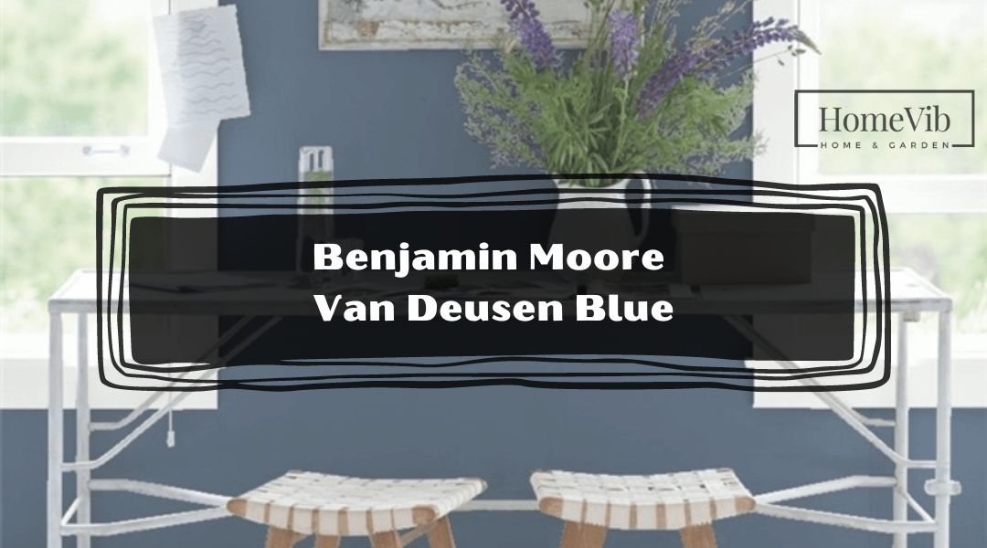
The Benjamin Moore Van Deusen Blue is probably among the most popular blue varieties. The undertones of gray and hints of green give the paint a fresh vibe that balances natural light, keeping the room lit but not too bright.
However, is Benjamin Moore Van Deusen Blue warm or cool?
Although Van Deusen Blue is brighter than the traditional navy blue, it is still a cool color because of the base color of blue, and the small amounts of green make the paint solid and a little darker.
In this article, I will discuss one of Benjamin Moore’s best-selling paints and provide you with other colors that go along well with Van Deusen Blue.
Is Van Deusen Blue Warm or Cool?

Benjamin Moore Van Deusen Blue is a mix of pale purple and blue to the untrained eye. However, it has a base color of blue with undertones of gray and tiny hints of green.
As a result, it produces a lighter version of navy blue. Some might even mistake it as a warm color due to its medium reflective value and how it attracts natural light from direct sunlight.
But this is not the case because the light it reflects isn’t as high as most traditional light colors. Also, blue, green, and gray are neutral colors, which makes them cool colors.
The great advantage of Benjamin Moore’s Van Deusen Blue is the neutral accents fit perfectly to either shade with lighter or darker shades. Thus, they make excellent home interior paint because they blend well with most paints and interior designs.
5 Beautiful Colors That Go Well With Van Deusen Blue?
Although Benjamin Moore’s Van Deusen Blue is a neutral color, the most common paint people use are those with coordinates of cream, beige, white, and light brown.
Since it has a darker accent, homeowners prefer pairing them with light colors.
But in general, they are excellent for various accents. However, some might still have difficulties searching for the best fit for the color.
And if you are among them, the following are 5 popular paints that many homeowners pair with Van Deusen Blue.
1. Simple White by Benjamin Moore
White is the most suitable partner for any variety of blue. But if you are not keen on using pure or immaculate, you can opt for other types of white such as Benjamin Moore’s Simply White.
The base color of white has undertones of strong yellow that produce a high reflective value, especially when the surface of the paint is hit by direct sunlight.
2. Pale Oak by Benjamin Moore
Since Van Deusen Blue has a classical vibe, it will blend well with colors with the same tone, such as Benjamin Moore’s Pale Oak. It has an elegant finish of white oak with undertones of warm gray.
As a result, it produces a high reflective value that matches the shades of Van Deusen Blue. It balances Pale Oak’s bright color, preventing the room from being too bright.
3. Coventry Gray by Benjamin Moore
Benjamin Moore’s Coventry Gray is another popular color that goes well with Van Deusen Blue. It has a medium solid shade of dark gray with undertones of blue.
The mix of blue and gray emits elegance and a calming atmosphere. In addition, the combination has a medium rating of reflective value that balances the light in the room.
4. Revere Pewter by Benjamin Moore
Benjamin Moore’s Revere Pewter has a noticeable solid color of light gray. Some people mistake the paint as solid gray, but it has a strong undertone of green when you look at the color closely.
The Revere Pewter paint works well with Van Deusen Blue since they both produce an airy vibe, ideal for homes near the beach or in hot areas.
5. Chantilly Lace by Benjamin Moore
Benjamin Moore’s Chantilly Lace has an impression of pure silk and cotton that compliments the pale gray tone of Van Deusen Blue.
It has a strong shade of white with no undertones but tiny hints of blue, yellow, and pink.
Chantilly Lace is your typical white paint, but the subtle yellow, pink, and blue mix adds vibrance.
It also has a glossy finish that creates a high level of reflection in a well-lit space.
Is BM Van Deusen Blue Good For Cabinets?
Benjamin Van Deusen works well with furniture such as your living room cabinets or vanity cabinets.
It also gives you much flexibility when moving your cabinets and pairing them with other interior design colors.
Is BM Van Deusen Blue Good Exterior Color?
Benjamin Moore’s Van Deusen Blue is ideal for the home’s interiors because it maintains a well-lit room without being too bright.
As an exterior, they are also perfect as trims or doors for houses with white or gray paintings because it allows your house’s colors to be more prominent and aesthetically pleasing.
Benjamin Moore Van Deusen Blue Compared To Other Colors
People often mistake Benjamin Moore Van Deusen Blue for several shades of blue, particularly navy blue.
However, the following are key distinctions of Van Deusen Blue and how they are fair with other varieties of blue.
BM Van Deusen Blue vs. Hale Navy

It is not hard to tell when you are comparing Hale Navy to Van Deusen Blue.
Although both have faded aesthetics, Hale Navy has stronger shades of green and dark gray, making them darker than Van Deusen Blue.
BM Van Deusen Blue vs. Newburyport Blue

The difference between Benjamin Moore’s Newburyport Blue and Van Deusen Blue is the reflective value.
Newburyport Blue is lighter, which makes it have a higher reflective value than Van Deusen Blue.
Also, Newburyport Blue is closer to navy blue and reminiscent of the old navy blue accent.
BM Van Deusen Blue vs. Kensington Blue

Benjamin Moore’s Kensington Blue is similar to Van Deusen Blue but darker and has a lower reflective value.
Thus, it is a good alternative to Van Deusen if you are uncomfortable with its reflective value.
BM Van Deusen Blue vs. Farrow and Ball Stiffkey Blue

From afar, you may not distinguish the difference between Farrow and Ball’s Stiffkey Blue and Benjamin Moore’s Van Deusen Blue.
However, you will immediately realize that Stiffkey Blue is darker and has stronger undertones of green.
Tips For Painting With Van Deusen Blue
Below are additional tips on how you can fully maximize Benjamin Moore’s Van Deusen Blue.
- Van Deusen Blue is a flexible variety of blue colors, but pairing them with colors with the same foundation and undertones of gray and blue may not help you achieve the desired results.
- The color blends very well with light colors such as gray, cream, beige, white, and light brown.
- It also blends with other light colors such as green, other types of blue, and yellow with a creamy texture.
- Although Van Deusen Blue is a common interior color, you can use them as a home exterior, such as trims, doors, backyard fences, or window frames.