If you’re looking for a cool gray shade, then Sherwin Williams Gray Screen might be right up your alley.
But what exactly is it?
SW Gray Screen is a cool, light shade of gray that’s just right for any interior design project. You’ll love how easy it is to paint this beautiful shade on your home.
So why not give it a try? It adds personality to your spaces and looks great with other colors.
Sherwin Williams Gray Screen is a light shade gray with a blue undertone. This makes it look like a transition from white to gray. In addition, the cooler shades of Gray Screen tend to have a little violet making them appear bluer. As a result, it makes the Gray Screen paint color look lighter and cooler than it is.
It’s also cool enough to make your room pop while maintaining a neutral feel. Overall, SW Gray Screen works well with any decorating style.
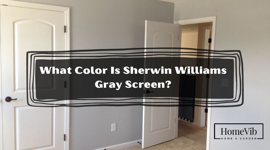
What Color Is Sherwin Williams Gray Screen?

Sherwin-Williams’ Gray Screen (SW 7071) has a beautiful blue undertone.
This creates a space with a lot of depth and personality. That is why it has become the most popular shade of paint ever sold by Sherwin-Williams.
Gray Screen is a good option to tone things more muted. Because of its light tones, Gray Screen belongs to the neutral family. The color is closer to a cold gray than a warm one.
Let’s dive even more into this shade!
Does Sherwin Williams Gray Screen Look Blue?
Gray Screen might seem completely blue depending on the room’s lighting. You can also observe the blue hues depending on the amount of exposure.
Moreover, the gray paint color Gray Screen also has a touch of little violet. In some lighting situations, the underlying blue tones of GS might seem quite purple.
In a more cool and chilly environment, this gray shade shines. However, Gray Screen doesn’t go well with the earth tones in the room spaces, such as cream and beige.
This colder gray goes nicely with other cool grays, white marbles, and dark and medium brown flooring.
Application
You may use this calming color everywhere you like. It’s great for hot regions since it creates the impression of a cooler space.
Consider it for your:
- Bathroom and Kitchen vanities
- Home Improvements Interior Doors Living Rooms
- Family rooms & Bedrooms
- Common Areas Workplaces and Playrooms
- Exteriors/Entryways
Is Sherwin Williams Gray Screen Warm Or Cool?
SW Gray Screen is an excellent cool neutral that goes well in any setting.
Gray Screen has a cool character, like most shades that lean heavily toward blue. Additionally, you can always count on this gray paint to look great.
This Gray Screen paint color by Sherwin-Williams is a true gray that is calming and soothing. It has a cool neutral tone and is perfect for rooms lacking natural light. Yet, it conveys a sense of calm and sophistication.
According to reviews, Gray Screen creates a mood due to its tonal consistency. But if you want to mix matte colors, this isn’t the best way.
This paint is a great option for a space to stand out and have personality. This is because of its richness and complexity.
It’s no surprise contractors, designers, and homeowners generally favor this paint.
What Undertones Does Sherwin Williams Gray Screen Have?
Gray Screen has underlying blue undertones. There’s a slight sense of violet to it as well.
Depending on the angle of view and the amount of ambient light, a gray screen may appear to be a solid blue. As a result, this blue and violet undertone looks great in spaces with cool temperatures.
Bluish-gray paint is a good choice if your furniture has cool blue overtones. Gray Screen is a safe pick if your space has a blue and green undertone.
Using As a Dominant Paint Color
Gray Screen gives off a quality of sharpness, coolness, and refinement.
This refined and modest gray is a color you can enjoy again and over again.
This shade is best used in places where the weather is consistently warm. You may appreciate the beautiful colors of this paint and put your imagination to work simultaneously.
Because of its cold undertones, this paint is excellent for creating a spacious area.
It will make the walls fade into the background. Then creating an airy and sophisticated atmosphere.
Colors That Goes With Sherwin Williams Gray Screen
You generally want to pair cold greys with chill colors like blue, light green, grey, and cool white.
Here are 5 colors that perfectly blend Gray Screen.
1. Chantilly Lace, Sherwin Williams
Choose a pure white paint color like Chantilly Lace with Gray Screen for the finest results. Every shade of gray has an undertone; the same is true with white paint.
When choosing a white for Gray Screen, pick something unique shade of white. There are several shades of white, including brilliant white with blue overtones.
Also, you can pair it with pure white, off-white, and cream.
2. Studio Blue Green, Sherwin Williams
Using darker shades together may transform a room’s aesthetic dramatically. To enhance the dramatic effect, go with light furnishings.
The blue-green is the scheme’s secondary tone, providing a lovely contrast. Meanwhile, it also gives the primary tone a sense of depth.
Overall, the lovely shade of bluish-green provides an extra dimension. Finally, complement the space with a set of pastel kitchen stuff.
3. Pelican Gray, Benjamin Moore
You can never go wrong when pairing it with the same tone as gray.
Here, Pelican Gray serves as an anchor for a light color scheme.
If you like two shades of grey but can’t decide which one try experimenting with two shades.
In case you were wondering, mixing different shades of grey is possible.
4. Vintage Vogue, Benjamin Moore
Generally, the combo of green and gray produces a calming color scheme of neutral tones.
Vintage Vogue and Gray Screen may complement several interior design schemes.
A room painted in green and grey will seem quickly updated with the addition of a modern accent.
5. Very Navy, Behr
Lighter shades of grey and blue are calming and modest and may give a space a modern and streamlined vibe.
Very Navy by Behr is a rare color that complements every tone in the Gray Screen palette.
Choose a warm, light grey to complement it, or make a dramatic statement with a light-toned grey.
What Is the LRV Of Sherwin Williams’s Gray Screen?
Gray Screen has a light reflective value of 59. Thus, above LRV-50, shades are less dense and reflect less light than they absorb.
That’s just in the middle of the color spectrum, yet it appears light. Keep in mind that the greater the value, the whiter the paint.
You should test a sample of the paint in your house to ensure that it will perform as desired.
Technically, here are Gray Screen’s RGB and HEX values.
- Red = 198
- Green = 202
- Blue = 202
- CSS Color: #c6caca
Simply put, LRV is a measuring technique often used to indicate how light or brilliant a color is.
A larger percentage means that the paint hue reflects more light. A greater value on a scale from 0 to 100 indicates a whiter paint color.
Is Sherwin Williams’ Gray Screen Right Choice For My Home?
The Sherwin-Williams Gray Screen will be the perfect choice for your space.
In most cases, Gray Screen could complement your dark furniture. Natural light and dark fixtures provide a soothing ambiance in your home.
Because of its cooler undertones, it pairs well with other cool grays.
You can blend it with hardwoods, medium browns, and white marbles. Mix and match it with stainless steel appliances and gray tiles.
For classic black and white, Gray Screen gives any space an air of understated elegance. Black metal fixtures and white marble flooring make for an elegant bathroom.
You must pay attention to the undertones if you have cherry, gray, or orange wood flooring. Look for kitchen and bathroom fittings, flooring, and furnishings.
Sherwin Williams Gray Screen Compared To Other Colors
Gray Screen can potentially make an excellent calming statement in the house.
But how about we compare it with other colors? Will it still stand out?
Let’s explore how Gray Screen goes with some additional shades.
Gray Screen vs. Repose Gray

In terms of color depth, Gray Screen and Repose Gray are comparable. They are both examples of cool paint shades.
Gray Screen has a rating of 59 for its Light Reflective Value, while Repose Gray has a value of 58 for its LRV. Thus, Gray Screen has taken on a whiter tone.
Repose Gray’s undertones are a complex mixture of brown, greige, gray, and purple. Meanwhile, the Gray Screen is primarily blue with some purple undertones.
Yet, Repose Gray is a challenging shade to work with due to its complicated undertones. The violet undertones shine out more than the blue ones.
With Gray Screen, you are at ease when blending it with neutral colors.
Gray Screen vs. Agreeable Gray

Gray Screen has an LRV rating of 59, while Agreeable Gray has an LRV of 60.
This means Agreeable Gray reflects light well and is a great choice for many rooms in a house. It’s a touch darker than popular shades, but that won’t be an issue assuming the space has lots of light.
Gray Screen is mainly considered a cool tone, whereas Agreeable Gray is a warm color. When paired with warmer tones, Agreeable Gray makes for a lovelier backdrop.
In addition, Agreeable Gray has a little green tone, beige and gray undertones. On the other hand, Gray Screen has blue and very mild violet accents.
As a greige, Agreeable Gray may be primarily used in practically any setting.
Overall, both shades look great with natural wood or bright white trim. Also, both can serve as blank slates to experiment with other accents and decor.
Gray Screen vs. Lazy Gray

Gray Screen is mainly classified as a light gray, while Lazy Gray is generally known as medium gray.
Also, Gray Screen gets an LRV of 59, but Lazy Gray scores 53. This only indicates that Lazy Gray is a shade darker.
Lazy Gray is a comfortable mid-tone between a subdued gray and a pastel blue. Gray Screen, on the other hand, has a cool tone with blue and purple undertones.
In most cases, Lazy Gray pairs wonderfully with yellows and whites. Lighter colors provide the illusion of more space while setting the mood for a good time.
Meanwhile, colors like blue, light green, grey, and cold white work well with Gray Screen.
Gray Screen vs. Passive

The LRV for Gray Screen is 59, which is lower than that of Passive at 60.
With a 1% difference, Passive becomes the lighter shade. Also, Gray Screen’s underlying blue tones stand up more prominently than in Passive.
As you can see, the Passive tone is a cool gray. As a result, it might look either bluer or whiter depending on the tones of the colors around it.
Both a Gray screen and a Passive both fall under cool tones. Yet, their undertones differ.
In some lighting conditions, you can observe Passive’s greenish undertone. It also reflects the color’s strong purple and blue tones.
On the other hand, Gray Screen is predominately blue and exhibits a few violet undertones.
Above all, both paint colors look best when viewed in spaces with plenty of natural light.
However, in a more subdued setting, Passive tends to look too frigid and dreary.
But with Gray Screen, you will have no problem matching it with crisp white paint. Remember that it also looks good with hardwood flooring.