Benjamin Moore Palladian Blue is a soft, muted blue-green color with a neutral gray undertone. It belongs to Benjamin Moore’s Historical Color collection and has a color code of HC-144.
Palladian Blue has a medium saturation and a low to medium brightness level, creating a calming and relaxing effect in any space.
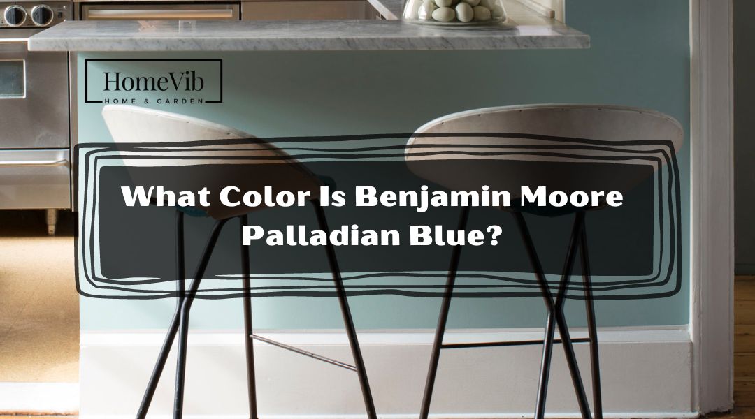
What Color Is Benjamin Moore Palladian Blue?
Benjamin Moore Palladian Blue has become popular with homeowners and designers alike. Its unique blend of blue and green tones creates a soothing, serene atmosphere that instantly transforms any room into a peaceful oasis.
Palladian Blue belongs to Benjamin Moore’s Historical Color collection, which consists of timeless and classic hues that have stood the test of time. This collection is inspired by the colors used in 18th and 19th-century architecture and design, giving it a sense of history and tradition.
One of the unique characteristics of Palladian Blue is its neutral gray undertone. This undertone helps to ground the color and keep it from feeling too bold or overwhelming.
Combining blue, green, and gray tones makes it versatile and can pair well with various other colors and design styles.
Is Benjamin Moore Palladian Blue Warm Or Cool?

Benjamin Moore Palladian Blue is a cool color with a blue-green hue that exudes a calming and soothing aura. Its color can make any space feel more peaceful and serene, making it a popular choice for bedrooms, bathrooms, and other areas where relaxation is key.
Cool colors like Palladian Blue are known to have a calming effect on the human psyche, so they are often used in spaces where a sense of tranquility is desired.
Blue is often associated with calmness, stability, and trust, while green represents growth, renewal, and nature. The combination of these two hues creates a color that is both refreshing and relaxing.
What Colors Go With Benjamin Moore Palladian Blue?
If you’re considering using Benjamin Moore Palladian Blue in your home, you may wonder what other colors will complement this cool and calming hue.
Incorporating colors into your design can create a beautiful and cohesive color scheme that complements the calming and soothing qualities of Benjamin Moore Palladian Blue.
Here are 5 great options to consider:
1. Benjamin Moore Simply White
Using Simply White on your trim, doors, and ceilings will highlight the beauty of your Palladian Blue walls, creating a cohesive and visually appealing space.
Combining these colors will make your indoor space feel bright, spacious, and welcoming.
So, if you want to enhance the ambiance of your home or office while also creating a relaxing and comfortable environment, consider pairing Palladian Blue with Simply White for a stunning result.
2. Sherwin Williams Sea Salt
Sea Salt works well as an accent wall, providing a subtle contrast to the calming tone of Palladian Blue.
You can also incorporate Sea Salt in your furniture pieces, such as a comfortable sofa or a cozy armchair, to create a sense of relaxation and comfort.
Whether you’re decorating a living room, a bedroom, or a home office, this color pairing can create a space that is both peaceful and inviting.
3. Behr Gray Mist
The soft gray hue of Gray Mist pairs beautifully with Palladian Blue, creating a calming and sophisticated atmosphere that will make your space feel more inviting.
For larger surfaces like walls or flooring, Gray Mist is an ideal choice to balance the cool tones of Palladian Blue.
By using Gray Mist as your main color, you can create a cohesive and visually pleasing environment that will make your space feel more harmonious and peaceful.
Whether you’re decorating your home or office, the combination of Palladian Blue and Gray Mist is a timeless and classic choice that will always stay in style.
4. Sherwin Williams Riverway
Riverway is a rich and luxurious deep blue-green color that can make a bold and impactful statement when paired with Palladian Blue. Combining these two colors can add a touch of drama and sophistication to any indoor space, making it perfect for those looking to make a statement with their interior design.
5. Benjamin Moore Woodlawn Blue
If you want to add depth and interest to your design, consider incorporating Woodlawn Blue into your color scheme.
This blue-gray hue closely matches Palladian Blue, creating a monochromatic color scheme that is visually appealing and calming.
Using Woodlawn Blue as a feature wall or for accent pieces will draw the eye and create a focal point in your space.
What Is The LRV Of Benjamin Moore Palladian Blue?
Benjamin Moore Palladian Blue has an LRV of 63.15, reflecting a moderate amount of light and having a mid-level brightness.
The moderate LRV of Palladian Blue makes it a versatile color that can be used in various lighting conditions.
Palladian Blue will appear brighter and more vibrant in well-lit rooms, while dimly lit rooms will appear more subdued and muted.
This is why it is important to consider a room’s lighting conditions when choosing a paint color.
It’s also important to note that the LRV of Palladian Blue may appear slightly different depending on the sheen of the paint.
Is Palladian Blue More Green Or Blue?
As its name suggests, Palladian Blue is a mix of blue and green tones, making it difficult to determine whether it is more blue or green. While there is no definitive answer to whether Palladian Blue is more blue or green, it is generally considered a soft blue-green color.
Depending on the lighting conditions and surrounding colors, it can appear more blue or green. Palladian Blue can appear bluer in bright light, while in low light, it can appear greener.
The unique blend of blue and green tones in Palladian Blue makes it versatile and works well with various other colors. It pairs well with neutral shades like beige and gray and cool colors like lavender and turquoise.
Will Benjamin Moore Palladian Blue Work In My Space?
Benjamin Moore’s Palladian Blue is a popular paint color choice for interior and exterior design projects, but many people wonder if it will work in their specific space.
The answer to this question depends on various factors, including the size and layout of the space, the amount of natural light it receives, and the overall design aesthetic you are trying to achieve.
Its soft blue-green hue can create a calming and serene atmosphere, making it a popular choice for bedrooms, bathrooms, and other spaces where relaxation is a priority. Additionally, its subtle color can provide a refreshing pop of color without overwhelming a space.
If you need to know whether Palladian Blue will complement the other colors in your space, consider getting a small sample of the paint and testing it out on a section of the wall or a piece of poster board.
The amount of natural light your space receives can also impact how Palladian Blue looks in your space. In bright light, the blue tones in the paint can appear more prominent, while in low light, the green tones may be more noticeable.
If you have a space that receives much natural light, consider using Palladian Blue in a more muted shade to avoid overwhelming the space with color.
What Is Lighter And Darker Than Palladian Blue?
Palladian Blue by Benjamin Moore has a soft and calming hue that creates a serene and welcoming atmosphere in any space.
However, many other paint colors are lighter or darker than Palladian Blue, and choosing the right shade for your specific design needs is important.
To help you make the best choice for your space, here are the comparisons of Palladian Blue to other paint colors.
By comparing Palladian Blue to other popular paint colors like Wythe Blue, Sea Salt, and Woodlawn Blue, you can find the perfect shade for your design needs.
Palladian Blue vs. Wythe Blue

Wythe Blue is a soft, green-blue hue often compared to Palladian Blue. While both colors have a similar calming effect, Wythe Blue has more green undertones than Palladian Blue.
Wythe Blue is a bit darker than Palladian Blue, with an LRV of 50 compared to Palladian Blue’s LRV of 65. This means that Wythe Blue can create a slightly more dramatic look than Palladian Blue, but both colors work well in various spaces.
Wythe Blue can be a great choice for creating a coastal-inspired design. It pairs well with natural materials like wood and woven textiles, creating a serene and peaceful atmosphere in any space.
Palladian Blue vs. Sea Salt

Sea Salt by Sherwin Williams is a popular paint color often compared to Palladian Blue. Sea Salt has more gray undertones than Palladian Blue, giving it a slightly cooler look.
Sea Salt is lighter than Palladian Blue, with an LRV of 63. Sea Salt can be a good choice if you’re looking for a lighter and more relaxed alternative to Palladian Blue.
Sea Salt works well in spaces that receive a lot of natural light, as it can enhance a room’s bright and airy feeling. It pairs well with neutral colors like white and beige and warmer colors like coral and blush.
Palladian Blue vs. Woodlawn Blue

Woodlawn Blue by Benjamin Moore is a soft, muted blue-green hue often compared to Palladian Blue.
While both colors have similar calming effects, Woodlawn Blue has more gray undertones than Palladian Blue. Woodlawn Blue is darker than Palladian Blue, with an LRV of 47.
Woodlawn Blue can be a good choice if you want a slightly darker and cooler alternative to Palladian Blue.
It pairs well with warm wood tones and natural materials like linen and jute. It can also create a sophisticated and elegant atmosphere in any space.