Benjamin Moore Van Courtland Blue is a blue-green paint color with gray and slightly greenish undertones. The undertones can appear more pronounced depending on the lighting and surrounding colors.
In natural light, the gray undertones are more prominent, while in artificial light, the greenish undertones may be more noticeable.
What Color Is Van Courtland Blue by Benjamin Moore?

As the name suggests, Van Courtland Blue is blue, but its specific shade is a mix of blue and green. Depending on the lighting and surrounding colors, it can also be described as grayish blue-green or blue-gray.
Van Courtland Blue is a versatile color that can work well in many interior design styles, from traditional to modern. It has a calming and soothing effect, making it a popular choice for bedrooms, bathrooms, and living rooms.
What Is the Color Code For Van Courtland Blue?
The color code for Van Courtland Blue is HC-145. When choosing the right paint color for your home, it is essential to consider the color code.
This unique code identifier allows you to select the color you want accurately. With the color code HC-145, you can be sure you are getting the desired shade of Van Courtland Blue.
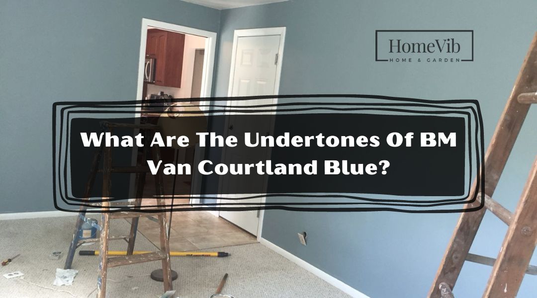
What Are The Undertones Of Van Courtland Blue?
Van Courtland Blue is a popular paint color described as a soft, muted blue with gray undertones. The gray undertones of Van Courtland Blue make it an excellent choice for creating a calming and soothing atmosphere in a room.
The muted blue hue adds a touch of color without being too bold or overwhelming. This makes Van Courtland Blue a great choice for bedrooms, bathrooms, and other spaces where relaxation is key.
The gray undertones of Van Courtland Blue also make it a great choice for modern and contemporary design styles. The color pairs well with other neutrals like white and gray and bolder accent colors like yellow or orange.
What Colors Goes With Van Courtland Blue?
When using these colors with Van Courtland Blue, it’s important to consider the overall mood and style you want to create. Always test paint samples in the space before committing to color to ensure it works with the lighting and other elements in the room.
Here are five colors that go well with Van Courtland Blue, along with some tips on how to use them:
1. Benjamin Moore Soft Chamois
This warm, creamy color pairs well with Van Courtland Blue and creates a cozy and inviting atmosphere.
Soft Chamois can be used on walls to create a neutral background that allows Van Courtland Blue to stand out as an accent color.
Soft Chamois can be used as an accent color in textiles or accessories, such as throw pillows or curtains.
2. Sherwin Williams Light French Gray
This light gray has cool undertones that pair well with the cool blue of Van Courtland Blue.
Use it on walls, as an accent color for a modern and sophisticated feel, or as an accent color in textiles or accessories.
Light French Gray can create a calm and calming atmosphere with Van Courtland Blue.
3. Behr Misty Coast
This light gray has warm undertones that complement the cool blue of Van Courtland Blue. Misty Coast can be used on walls or in textiles for a cozy and inviting feel.
When used in materials, such as a comfy throw blanket or area rug, Misty Coast can create a warm and inviting atmosphere that balances out the coolness of Van Courtland Blue.
4. Benjamin Moore’s Quiet Moments
This soft blue-green color has cool undertones that pair well with the cool blue of Van Courtland Blue. Use it on walls or in textiles for a calming and serene atmosphere.
When paired with Van Courtland Blue, Quiet Moments can create a harmonious and relaxing environment perfect for bedrooms or bathrooms.
5. Benjamin Moore Thunder
This medium gray has cool undertones that complement the cool blue of Van Courtland Blue. Thunder can be used on walls for a modern and sophisticated feel or as an accent color in textiles or accessories.
Thunder can add depth and contrast to a room that features Van Courtland Blue as the dominant color when used as an accent color.
What White Goes With Van Courtland Blue?

When choosing a white paint color to pair with Van Courtland Blue, one great option is Alabaster by Sherwin Williams.
This warm white has a slight beige undertone that complements the cool blue of Van Courtland Blue, creating a cohesive and inviting look.
Alabaster is a versatile white that works well in various spaces and design styles. It pairs well with warm neutrals like beige and taupe and bolder accent colors like navy or green.
When used on walls or trim, Alabaster creates a cozy and inviting atmosphere perfect for bedrooms, living rooms, and other spaces where relaxation is key.
Is Van Courtland Blue Good Exterior Color?
Van Courtland Blue may not be the first color that comes to mind for exterior use, but it can still be a great choice when paired with the proper trim and accent colors.
When using this color on your home’s exterior, consider the other elements in your landscaping and architecture to create a cohesive and stylish look that complements your home’s natural surroundings.
Pairing Van Courtland Blue with white trim and black shutters creates a classic New England look that is both elegant and sophisticated. Another way to use Van Courtland Blue on a home’s exterior is to pair it with natural wood tones.
This creates a warm and inviting atmosphere perfect for rustic or farmhouse-style homes. Using Van Courtland Blue on the front door and pairing it with a natural wood porch creates a welcoming entryway that is both stylish and inviting.
Is Van Courtland Blue Good For Kitchen Cabinets?
Van Courtland Blue is a popular paint color used in many interior design projects, including kitchen cabinets. When using Van Courtland Blue on kitchen cabinets, it’s essential to consider the other elements in the space.
If you have a lot of natural wood tones in your kitchen, you may want to choose a warm white or cream color for your cabinets to create a cohesive look. You may select a cooler white or gray color to complement stainless steel appliances.
Another consideration when using Van Courtland Blue on kitchen cabinets is the finish. Consider using a high-gloss finish that reflects light and creates a sleek surface for a modern and sophisticated look.
Is Van Courtland Blue Good For Bedroom?
If you have a lot of natural wood tones in your bedroom furniture, you may want to choose a warm white or cream color for your walls to create a cohesive look.
Similarly, if you have a lot of metallic accents in your bedroom decor, you may want to choose a cooler white or gray color to complement these materials.
This color can appear darker or lighter depending on the natural lighting conditions in the room. If you have a bedroom with lots of natural light, Van Courtland Blue can create a bright, airy atmosphere perfect for relaxation.
If your bedroom has less natural light, you may consider using a lighter shade of blue or adding additional lighting.
Are Waters Edge And Van Courtland Blue the Same?

Waters Edge and Van Courtland Blue are two popular paint colors that are often compared to one another due to their similar cool blue tones.
While these colors may appear identical at first glance, there are some key differences to consider when choosing between them.
Waters Edge is a slightly lighter and brighter blue than Van Courtland Blue, with a little green undertone. This color is reminiscent of the ocean on a clear day and pairs well with other cool colors like white and gray.
When used in a room, Waters Edge creates a calming and refreshing atmosphere perfect for bedrooms, bathrooms, and other spaces where relaxation is key.
Van Courtland Blue, on the other hand, is a deeper and more muted blue with gray undertones. This color is reminiscent of a stormy sky and pairs well with warm neutrals like beige and taupe.
When used in a room, Van Courtland Blue creates a cozy and sophisticated atmosphere perfect for living rooms, dining rooms, and other spaces where a more formal look is desired.
What Is the Difference Between Van Courtland Blue And Revere Pewter?

Van Courtland Blue and Revere Pewter are two popular paint colors that are often compared to one another due to their similar gray undertones. Van Courtland Blue is a cool blue with gray undertones, while Revere Pewter is a warm gray with beige undertones.
This difference in undertones creates a different overall look and feel in a space. Van Courtland Blue creates a calming and serene atmosphere, while Revere Pewter creates a cozy and inviting atmosphere.
Another difference between these colors is their versatility in different lighting conditions. Van Courtland Blue can appear darker or lighter depending on the natural lighting conditions in a room.
At the same time, Revere Pewter tends to hold its color and warmth in various lighting conditions.