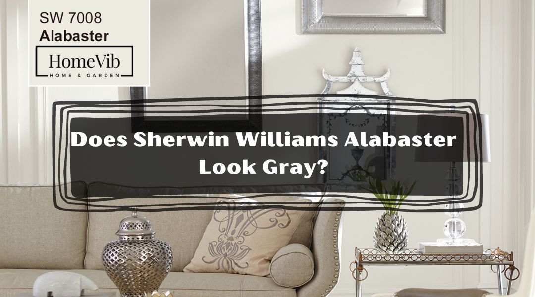
Do you have a Sherwin Williams Alabaster vanity? If so, you may be wondering if it looks gray.
We’ve got the answer for you!
Some people think that alabaster is a pale gray color. But it’s a warm white with greige and beige and gray undertones.
So, if you want to know whether Alabaster looks gray, look at it in different lighting conditions. But it will probably look gray if you’re in an area without much natural light. This is especially true if some artificial lights surround it.
No, Sherwin William’s Alabaster does not look gray. Thus, it reflects a warm white paint color with greige undertones. Even if your room faces the north or east, it won’t appear chilly or gray. Depending on the lighting, Alabaster can appear very white or creamy white. If you want a more muted contrast, you may combine it with white trims.
Does Sherwin Williams Alabaster Look Gray Or Beige?
Sherwin-Williams’ Alabaster is not gray, although it looks like warm white paint with greige undertones.
People sometimes mistake cream or creamy white for beige. Then sometimes, as greige because of the warmth offered by yellow undertones.
However, Alabaster is a warm white shade. Its golden undertones stand out from other, colder white paint options.
As you can see, Alabaster may seem either extremely white or creamy white. That will depend on the intensity of the lighting.
Hence, Alabaster is not the best option if you want a pure, cold white. Alabaster isn’t the best choice if you want a pure beige color.
If you want a warmer white to go with the colors in your house, alabaster is a great option. Get a sample of the alabaster hue and see how it looks next to your existing furnishings and home decor.
Overall, if you’re looking for a bright and cozy white, this gentle, golden tone is a good option. It will boost tranquility within the space.
What Color Is Sherwin Williams Alabaster?

Sherwin William’s Alabaster is a gentle off-white.
It’s not white but close due to the neutral beige undertones. Due to its moderate beige undertones, this paint color is creamy without being too so.
Generally, Alabaster (SW 7008) is one of the white paint colors of Sherwin-Williams.
Alabaster is more beige than white. Although Alabaster is mainly listed in the white division by Sherwin Williams, it is not a real white.
Moreover, you won’t find much yellow in SW Alabaster. It has a neutral foundation that makes it appear creamy and almost off-white.
Alabaster’s undertone has a solid foundation that keeps it away from the yellow tone. As mentioned earlier, the neutral undertones give it a slight hint of warmth. Then it shifts closer to an almost off-white tone.
Applications
Use this gentle, warm, yet well-balanced white when you need the lightness of white. It will brighten up without compromising the comfort of a cozy hue.
Additionally, any decoration will pop against this off-white paint. It will also make the decorations the focal point of the room. You will notice that this shade blends easy adjustments to the decorations.
Is SW Alabaster Too White?
No, SW Alabaster is not too white. Compared to basic whites, Alabaster is a warmer white with greater complexity.
Furthermore, it is an off-white shade. Alabaster may look a little creamier next to a cooler, purer white, but it will pop next to grays and beiges.
Here are some key facts about SW Alabaster.
- LRV of SW 7003 Alabaster: 82
- R: 237 G: 234 B: 224
- Hex Value: #edeae0
Undertones
Alabaster has soft beige undertones that are both warm and delicate. These strike a nice balance between being too chilly and too warm.
In most cases, Alabaster is a go-to neutral for many interior designers and homeowners. This is because it strikes the ideal mix between warm and cool tones.
Combinations
Sherwin Williams has specifically suggested colors that complement alabaster. They say that soft pink or grays go nicely with alabaster.
They also highly suggest mixing it with modern and classic decorations in the home.
They recommend pairing Alabaster with one of their darker hues if you want to avoid it.
Is Sherwin Williams Alabaster Cool Or Warm?
Sherwin Williams’ Alabaster is a warm shade with off-white and neutral undertones.
Additionally, Sherwin-Williams chose it as their 2016 color of the year. This is because it evokes feelings of “personal consolation and rebirth.” They believe it makes the space very calming and serene.
As a result, Alabaster consistently ranks high on the list. It has dominantly been the favorite paint color among homeowners.
Placements and Positioning
Regarding harmonizing with furniture, and paintings, Alabaster is your top pick.
It has a clean, contemporary vibe without being overly bright or stark. Also, it pairs beautifully with greige paint and lighter wood.
Just be aware of the ambient light in the room. Light coming from the north is ideal for alabaster. That is mainly because it doesn’t appear excessively yellow or milky.
Lighting
Each color might seem different depending on the lighting conditions. It’s essential to consider how the paint will look in the room in several lighting scenarios.
Rooms facing North
North-facing rooms are usually bathed in a cooler, bluer light. Lighter tones, like Alabaster, may seem flat in a north-facing room. This is mainly because of the absence of natural light.
Rooms facing South
As it works well with warm and cool tones, Alabaster is the best tone in a south-facing setting. Sherwin-Williams’ Alabaster paint brings out the color’s yellow-free warmth.
Rooms facing East
East-facing rooms get the warmest morning light, a yellowish-orange shade. As a result, Alabaster adds a touch of elegance and warmth to East-facing rooms.
Rooms facing West
Warmer tones may appear too intense in the reddish-orange light. A west-facing Alabaster space might be the most appealing.
5 Best Colors That Go With Alabaster
As we’ve discussed, this neutral shade is neither as cool as white nor as warm as beige. So this makes it suitable for use with various design schemes.
For a relaxing and uplifting bedroom, try peach, navy, and a dash of vibrant orange.
Here are some of the best colors that will complement well with the Alabaster shade.
1. Silver Strand, Sherwin Williams
Combined with Silver Strand, Alabaster’s pure whiteness creates a stunning effect.
The image shows that it’s a good complement to various other blue-gray hues. Adding crisp white trim will make Silver Strand stand out.
Silver Strand pairs well with other warm neutrals, including tans and taupes. It also blends well with browns, and even greige, just like Alabaster.
2. Sea Salt, Sherwin Williams
A warmer white, Sherwin-Williams Alabaster works wonderfully with Sea Salt.
Sea Salt may look well with various white, gray, beige, and greige hues. As opposed to being blue, sea salt is a drab green. Yet, the chilly gray may make sea salt appear bluish-green in daylight.
Overall, the crisp whites of Alabaster complement Sea Salt quite nicely.
3. Simply White, Benjamin Moore
Using Alabaster with BM’s Simply White will draw attention to the mellow undertones.
In this image, the doors pretty achieve a creamy shade of Alabaster. At the same time, the walls reflect an elegant bright white.
Simply White also looks soothing with beige, off-white, or neutral grey.
4. Accessible Beige, Sherwin Williams
Due to warm undertones, Accessible Beige works best when combined with warm Alabaster.
We recommend this shade for cabinet and trim painting. To illustrate how well it complements, see the image above.
Generally, creamy whites and greys complement Accessible Beige. You can also choose a brown or off-white wall color and pair it with a white or brown backsplash.
5. Ultra Pure White, Behr
Behr’s Pure White is a wonderful choice if you want to create some visual interest. You can contrast it with the walls and trim, but not be too chilly.
Alabaster is a warmer white, while Behr’s Pure White will be a touch brighter and cooler in tone. However, both will read as soft whites.
Only the smallest trace of yellow is present in Pure white, lending it the slightest hint of warmth.
How Does Sherwin Williams Alabaster Look Compared To Other Colors?
Alabaster’s neutral warmth makes for a harmonious appearance compared to other shades.
If you look at it next to other colors, you can see that it’s noticeable right away. The fact that it has a soothing white color makes it a possible top pick.
Alabaster will be visibly creamy when set against purer, brighter whites. When used alone, it can fool the eye into thinking it’s looking at a real white.
Let’s see how it stacks up against the next tones!
Sherwin Williams Alabaster vs. Benjamin Moore White Dove

When compared to Alabaster, White Dove seems rather brighter.
The LRV for White Dove is 85. Meanwhile, the LRV value of Alabaster is 82. Thus, Alabaster may be less white than White Dove.
In this regard, Alabaster is more inviting and soothing. This is due to its combination of gray and beige tones. Nevertheless, White Dove is a softer, more muted gray.
Overall, BM White Dove is far better than Alabaster. It is apparent in keeping a warm texture to exterior spaces.
Still, both are highly recommended for your upcoming home improvement project.
Sherwin Williams Alabaster vs. Greek Villa

Both Greek Villa and Alabaster are cream colors. However, Greek Villa is more of a beige cream, and Alabaster is more of a gray cream.
Additionally, both colors have beige and grey undertones. In comparison to Alabaster, the tones and overall feel of the Greek Villa are warmer and less gray. Greek Villa has a higher LRV of 82 than Alabaster at 82.
Compared to the cooler tones of Alabaster, the Greek Villa feels much more soothing.
So, Greek Villa is whiter, brighter, and lighter in tone than Alabaster. In that case, this tone might be the ideal style if your room lacks natural light.
Above all, if you have a lot of blues in your decor or worry about a shade going yellow, Alabaster is a better choice.
Sherwin Williams Alabaster vs. Snowbound

Alabaster and Snowbound are generally classified as warm white or off-white. However, their underlying tones are notably distinct from one another.
Regarding LRV, Snowbound gives off 83, compared to Alabaster at 82.
So, the beige undertones in Alabaster help create a cozy vibe compared to Snowbound.
But, Snowbound has a more vibrant appearance than Alabaster. That is even if Alabaster has a creamier texture.
If your windows face north, the light will be generally muted, and you can’t feel any harshness.
By all means, Snowbound can reflect a lot of sunshine without making it too harsh to look at from the outside.
Sherwin Williams Alabaster vs. Pure White

Off-white paint colors like Alabaster and Pure White are quite popular.
With a beige color palette, Alabaster is a neutral option. Pure White, however, has a touch of yellow to it. In truth, it doesn’t look yellow but creamy, which helps it avoid coming off as clinical or icy.
Additionally, \the LRV of Alabaster is 82, less than that of Pure White (84).
So, Alabaster is the best option to create a welcoming atmosphere in your house. Remember that this shade reflects a warmer, creamier tone.
However, Sherwin-Williams’ Pure White, though still a delicate white. Yet, it has a colder undertone than its other whites. Remember that Pure White is not white or clinical since it has a small amount of yellow.
Ultimately, it’s no secret that Alabaster is the most popular choice among SW white paints. This color scheme has been widely used for over a decade. No wonder homeowners make it their top pick.