Sherwin Williams Kilim Beige is a warm, neutral color. It is classified as a beige or tan shade. Kilim Beige has subtle yellow undertones, giving it a warm and inviting appearance.
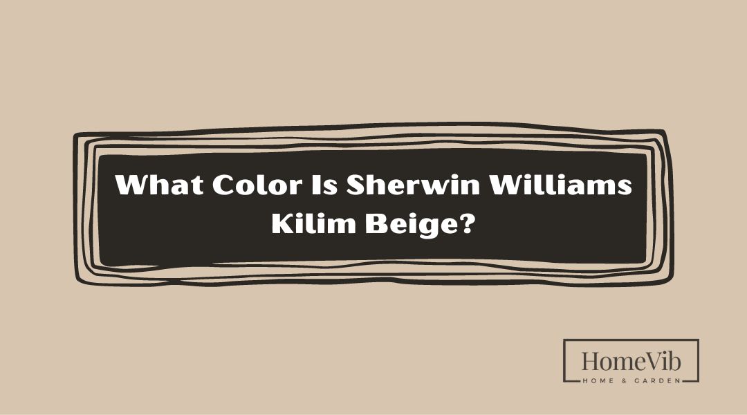
What Color Is Sherwin Williams Kilim Beige?

Sherwin Williams Kilim Beige is a warm and neutral beige color. It is often described as a light-to-medium beige with subtle yellow undertones.
Kilim Beige has a soft and inviting appearance that adds warmth and depth to a space. It is a versatile color that works well in various design styles, from traditional to contemporary.
Kilim Beige can create a cozy and comfortable ambiance when used on walls. It is an excellent backdrop for furniture, artwork, and other decor elements.
Whether in residential or commercial settings, Sherwin Williams Kilim Beige is a popular choice for those seeking a warm, neutral color that pairs well with various other shades.
Is Sherwin Williams Kilim Beige Warm Or Cool Color?
Sherwin Williams Kilim Beige is considered a warm color. It has warm undertones that contribute to its inviting and cozy appearance. Kilim Beige’s warm characteristics make it well-suited for creating a comfortable and welcoming atmosphere in a space.
It pairs nicely with other warm colors or can balance cooler shades within a room’s color scheme. Whether used as a primary color or as an accent, Sherwin Williams Kilim Beige brings a sense of warmth and comfort to any interior or exterior application.
What Undertone Does Kilim Beige Have?
Kilim Beige has a distinctive undertone that adds depth to its overall appearance. The primary undertone present in this color is a subtle touch of yellow.
The yellow undertone infuses a sense of warmth and brightness into the beige base, creating a vibrant and lively color. This undertone can become more prominent or subdued based on lighting conditions and the surrounding colors in a room.
Considering these factors when selecting Kilim Beige for your space is essential to ensure it aligns with your desired aesthetic.
Does Kilim Beige Look Peach?
No, Sherwin Williams Kilim Beige does not typically look peach. Kilim Beige is primarily a warm, light-to-medium beige color with subtle yellow undertones.
While it can appear slightly warmer in certain lighting conditions, it does not possess strong peach undertones. Peach colors usually have stronger pink or orange undertones, differentiating them from Kilim Beige’s more neutral and beige appearance.
However, it’s essential to consider that individual perception and lighting conditions can influence how colors are perceived. It is always recommended to view a physical paint sample or consult with experts to evaluate how Kilim Beige will appear in your specific environment.
What Colors Go With Sherwin Williams Kilim Beige?
Sherwin Williams Kilim Beige is a warm and inviting color that pairs well with various other colors. Sherwin Williams Kilim Beige is a versatile and friendly color that pairs beautifully with a wide range of complementary shades.
This section will explore five specific colors from Behr, Sherwin Williams, and Benjamin Moore that harmonize with Kilim Beige, their unique characteristics, and where they can be used.
1. Behr Perfect Taupe
Behr Perfect Taupe is a cool-toned taupe color that complements the warmth of Sherwin Williams Kilim Beige. Its blend of gray and brown creates a serene and balanced look.
Perfect Taupe works well in living rooms, bedrooms, or even bathrooms. It can be used on accent walls or as a primary color for a soothing and elegant atmosphere.
Consider incorporating cool blue or green accents such as Behr’s Rain Washed or Benjamin Moore’s Edgecomb Gray to enhance the harmony.
2. Behr Pewter Mug

Behr Pewter Mug is a warm and medium gray shade that adds depth and richness when paired with Kilim Beige. This color brings a cozy and inviting feel to a space and works particularly well in living rooms, dens, or bedrooms.
Pewter Mug can be used on accent walls, furniture pieces, or even as a base color. To complement this combination, consider incorporating warm-toned accents such as burnt orange or deep burgundy, creating a harmonious and sophisticated ambiance.
3. Behr Rain Washed
Behr Rain Washed is a soft, muted blue-green shade that complements Kilim Beige’s warmth. This calming color evokes a sense of tranquility and is perfect for bedrooms, bathrooms, or even home offices.
Rain Washed can be used as a wall color, paired with crisp white trim or wainscoting. To enhance the peaceful atmosphere, incorporate natural wood accents and accessories in earthy tones for a cohesive and inviting look.
4. Sherwin Williams Urbane Bronze
Sherwin Williams Urbane Bronze is a deep, moody brown-gray shade contrasting with Kilim Beige. This color works well in smaller spaces like bathrooms or entryways, where it can add a touch of intimacy and sophistication.
Urbane Bronze can be used on doors, trim, or even as an accent wall to create a dramatic focal point. To enhance the luxurious feel, pair it with metallic accents such as gold or brass and crisp white or cream elements for a visually stunning combination.
5. Benjamin Moore White Dove
Benjamin Moore White Dove is a warm white shade harmonizing beautifully with Kilim Beige. This timeless and classic color works well in kitchens, bathrooms, or any space you want to create a clean and refreshing feel.
White Dove can be used on walls, cabinetry, or even as a trim color. To complement this combination, consider incorporating natural textures such as wood or stone and subtle pops of color through accessories or artwork for a balanced and inviting environment.
What Is the Difference Between Sherwin Williams Kilim Beige And Accessible Beige?

Sherwin Williams Kilim Beige and Accessible Beige are two popular paint colors offered by Sherwin Williams. While they share some similarities, there are notable differences between the two.
- Undertones
The primary difference between Kilim Beige and Accessible Beige lies in their undertones. Kilim Beige has subtle yellow undertones, giving it a warm and inviting appearance.
On the other hand, Accessible Beige leans more towards a greige (a blend of gray and beige) with subtle taupe undertones. This makes Accessible Beige a more neutral and versatile option that can complement a broader range of color schemes.
- Depth and Intensity
In terms of depth and intensity, Kilim Beige is slightly darker and more affluent than Accessible Beige. Kilim Beige has a deeper saturation that creates a warmer and cozier feel.
At the same time, Accessible Beige is lighter and has a softer presence. This distinction may be particularly noticeable in rooms with ample natural light, where Kilim Beige can provide a more intimate atmosphere. At the same time, Accessible Beige appears brighter and airier.
- Versatility
While both Kilim Beige and Accessible Beige are considered neutral colors, Accessible Beige offers greater versatility due to its more balanced greige undertones.
Accessible Beige can adapt well to various design styles, seamlessly blending with warm and cool color palettes. It works harmoniously with accent colors and easily accommodates different furniture styles and finishes.
- Lighting Conditions
Lighting conditions influence both colors. Kilim Beige exhibits warmer undertones in well-lit areas, enhancing its golden hues. Accessible Beige, being a greige color, may appear cooler or warmer depending on the lighting in the room.
It is essential to test paint samples under different lighting conditions to fully understand how the colors will interact with the specific lighting in your space.
What Is the Lighter Version Of Kilim Beige?

The lighter version of Sherwin Williams Kilim Beige is Sherwin Williams Canvas Tan. Canvas Tan shares warm and neutral characteristics with Kilim Beige but is lighter in tone.
It has a subtle beige undertone that creates a soft and inviting atmosphere. This lighter shade is ideal for spaces where you want to maintain a warm and cozy feel while introducing a brighter and more airy ambiance.
It can be used as a wall color in various rooms, including living rooms, bedrooms, or even hallways, to create a welcoming and light-filled environment.
What Color Is Darker Than Kilim Beige?

Sherwin Williams Nomadic Desert is darker than Sherwin Williams Kilim Beige. Nomadic Desert is a warm and medium-toned beige with slightly deeper and richer hues than Kilim Beige.
While still within the beige color family, Nomadic Desert has a darker saturation that adds depth and creates a more prominent presence in space. It can be used as an accent wall color or as the primary color in rooms where a cozy and intimate atmosphere is desired.
Nomadic Desert can create a sophisticated, elegant look paired with lighter neutral tones or complementary colors.