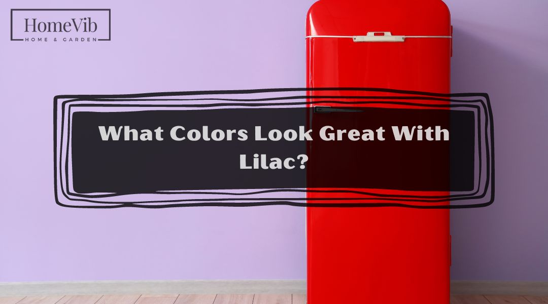
People often mistake the color lilac for purple or lavender because of its similarities with the tone of the said colors.
Although it has similarities, it is a different color that emits a unique way of creating a relaxing atmosphere and elegance.
But the great thing about lilac is that it is flexible and matches very well with other colors.
So the question is, what tones blend perfectly with lilac?
Lilac blends well with both colors that have dark and light tones, such as Orange Froth, Relentless Olive, Bursting Lemon, Graphic Charcoal, Hale Navy, Fired Brick, and Calico Rose, to name a few of them.
In this article, I will share additional information about the shade of color and provide insight into why they work perfectly well with lilacs.
What Color Is Lilac?
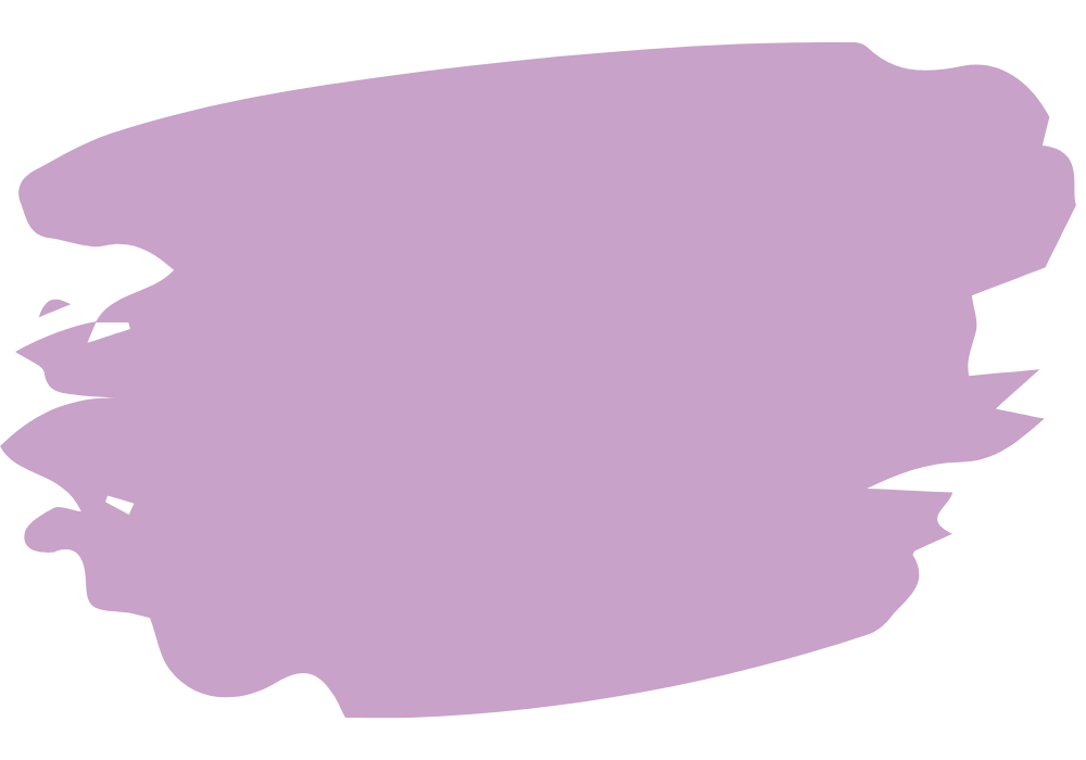
Lilacs have shades of color that bear the same characteristics as purple or lavender. However, it is a different color that gives a room a unique elegance but calming and dramatic effects.
Furthermore, lilac is a purple shade with a paler tone that is attributable to a flower with the same name of the color.
It has a rich and deep palette but is also soft and warm, reminding you of spring.
Is Lilac Color Pink Or Purple?
The dominant color of lilac is purple, which has a lighter contrast. It has the same shade of color as the flower lilac.
And lilac’s warm and soft tone is due to the undertones of pink. Although it has hints of pink, lilac is still a variety of purple because of its high concentration of purple.
Lavender is another mix of colors that has similarities with lilac. The factor you must note with lavender is that it has a darker shade because of its blue undertone.
Is Lilac a Dark Color?
Lilac has a prominent pale purple feature. It has a deep but rich color, but the soft, warm tone makes it light rather than dark.
Also, the light characteristic of the paint draws more natural light, which is excellent during the day to save energy.
Is Lilac Cool Or Warm?
The pink undertones of lilac make them warmer. However, they are not as warm as pink or yellow, and the dominant purple color gives them a soft tone that provides a relaxing atmosphere.
Is Lilac a Happy Color?
The pale purple color of lilac has a dramatic feel but is vibrant, motivational, and boosts your mood.
7 Best Colors That Go With Lilac
Lilac works best for the interiors of a home. And it creates a soothing and energetic color scheme that motivates you when you can pair it with the right color.
Below are 7 great colors you have to note that match well with lilac.
1. Orange Froth (151) by Benjamin Moore

The hallmark of Benjamin Moore’s Orange Froth is its bright hues of orange with undertones of cream mellows.
The color has a high concentration of cream mellow, making it even warmer than a traditional orange color.
Thus, the bright shade of Orange Froth matches the soft and warm tones of lilac’s pale purple color.
If you want to improve lighting in a room during the day, pairing lilac with Benjamin Moore’s Orange Froth is the best option.
2. Relentless Olive (SW 6425) by Sherwin Williams
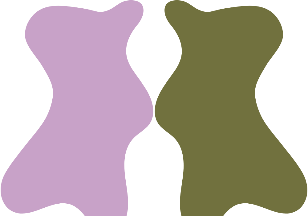
The great advantage of lilac’s soft and warm colors is its flexibility, allowing it to blend well with light and dark.
When it comes to colors with deep tones, the best option available to you is Sherwin Williams’ Relentless Olives.
It has an army green base color with undertones of warm yellow. Nevertheless, the deep dark green color makes it a dark color that works best with lilac’s bright pale purple.
3. Bursting Lemon (KM5202) by Kelly Moore

Kelly Moore’s Bursting Lemon has the natural shade of lemon fruit that will remind you of the tropics and summer season.
It has tiny hints of beige that neutralize the strong yellow color of Bursting Lemon, making it paler and lighter.
As a result, it matches very well with the cheerful aesthetic of lilac, as they both draw natural lighting into the room.
However, Kelly Moore’s Bursting Lemon works well if the color is a secondary color to lilac, meaning it is a strip or outline instead of a primary color, such as the walls.
This is because its yellow foundation is too bright and could be unpleasant to see when it draws natural light from the sun.
4. Graphic Charcoal (N500-6) by Behr

One of the best partners to lilac’s light and soft tones is a color with darker tones, such as Behr’s Graphic Charcoal.
The great thing about Graphic Charcoal is it has a beautiful combination of black with strong undertones of gray that balance the dark shade of black.
As a result, it produces a lighter version of black that is more elegant yet minimalistic.
Charcoal Gray works very well as a secondary color to lilac because it makes the tones of the color prominent.
If you are planning to make lilac the focal point and looking for the perfect color to help you achieve your goals, Behr’s Charcoal Gray is the best fit for your preferences.
5. Hale Navy (HC-154) by Benjamin Moore

Hale Navy is another dark color that perfectly matches the shade of lilac. Both have a mix of blue that makes the two colors blend well.
In particular, Benjamin Moore’s Hale Navy has a beautiful shade of dark blue with hints of gray that produce a calming and soothing blend.
You can never go wrong with Hale Navy because it maintains the balance of light and dark features of two colors.
The deep dark blue characteristics of Hale Navy are the perfect match for the deep and light purple shade of lilac.
Combining the two gives you a shade of color that creates a relaxing ambiance.
6. Fired Brick (SW 6335) by Sherwin Williams
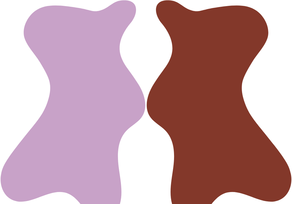
The hallmark of Sherwin William’s Fired Brick is its clayish and light maroon tone. It is a variety of red with a dramatic vibe, making it an appealing color to apply in a room.
The deep and warm colors of Fired Brick are not a good option for some parts of the home, such as the living room, because the bright colors are unpleasant.
However, the combination of Fired Brick and Lilac is best for the bedroom or study room.
However, due to the strong and bright colors of Fired Brick, it is not ideal as a secondary color. The Fired Brick is perfect for the walls, where lilac is a secondary color.
7. Calico Rose (KM4410) by Kelly Moore
Kelly Moore’s Calico Rose is a pale rose gold color with a vibrant and dramatic shade of color simultaneously. It has a captivating and warm color that works well with lilac’s soft and warm hues.
Both warm tones are a perfect color in the living room or kitchen because it draws sunlight and improve the natural light during the day.
However, you have to break the bright colors with accent furniture.
Since the interior colors of the walls are already bright, the recommendation is to use dark-colored furniture and appliances to complement the shades of lilac and Kelly Moore’s Calico Rose.
Are Lilac And Lavender the Same?
People often mistake lavender for lilac because of the shade of purple. However, you must note that they are two colors with various contrasts.
Although both have a pale hue, the two have different shades of pale contrast. Lavender has a paler shade of purple, while lilac has a deeper shade of purple.
In addition, lilac has a pink undertone, while lavender has a blue undertone.
What Is the Best Color To Match With Lavender?
Lilac’s warm, soft shade of color emits a sense of serenity and elegance. It has a neutral color that makes it flexible for both darker and lighter hues.
Regarding warm colors, the best color you can pair with lilac is cream or beige.
On the other hand, the best color you can match with lilac, which has a darker shade, is navy blue or any color with a gray undertone.

