The color profile of turquoise has identical characteristics with the precious stone of the same name. It has a pale blue and green consistency with tiny hints of yellow.
Their deep but light color makes them a desirable wall paint, emitting a relaxing and cheery atmosphere.
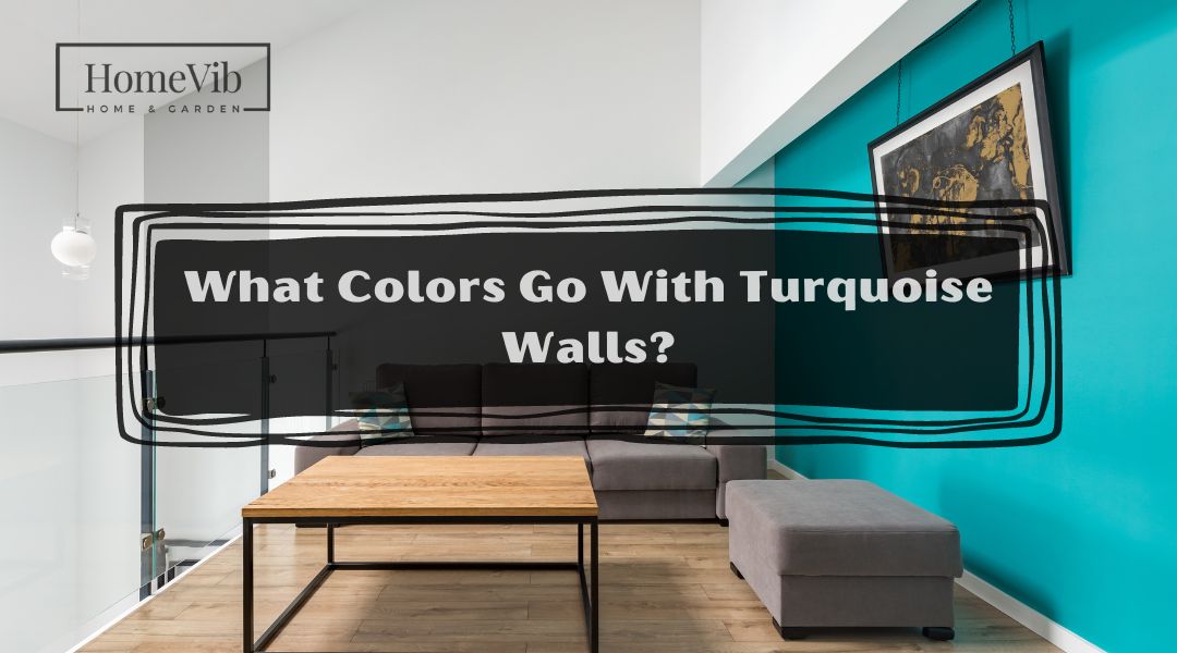
However, the question is, what colors go well with turquoise?
The colors that blend perfectly are those with bases of dark blue, gray, and copper. Golden Meadow, Naval, Antique Copper, Grape Harvest, and Blue Spruce are some of the best examples.
In this article, I will provide the specifications of the said colors and help you choose the right one for your interior walls.
Is Turquoise a Warm Or Cool Color?

Turquoise is in the middle of the cool and warm spectrum. This is the case because it combines blue and green, which are cool, with tiny hints of yellow, which are warm.
The color profile of turquoise has a balanced consistency that is ideal for both dark and light colors.
Distinguishing whether turquoise is warm or cool may depend on how the homeowners feel about the cool.
But it is undeniable that the turquoise is relaxing and has a dramatic but eccentric positive vibe.
Is Turquoise a Good Wall Color?

Turquoise is a popular color in the fashion scene or whenever you need to level up your outfit for the day. This is because it has an elegant texture that suits modern and classical styles.
Fortunately, turquoise is also perfect in a modern home’s interiors, making a space aesthetically pleasing. As flexible as turquoise with other colors, it can also blend with any interior design.
What Colors Compliment Turquoise?
Turquoise is warm and cool, ideal for light and dark colors. Although turquoise is flexible, some sets of colors complement it, such as varieties with a base color of copper, gray, and dark blue.
Surprisingly, the flexibility of turquoise extends toward its compatibility with its opposite colors, such as orange and red.
And using these sets of colors on your turquoise walls brings out its best by making the colors more prominent.
As you see, you can never go wrong with turquoise. They are ideal in any section of your home, such as the living room, bedroom, study area, kitchen, or even the exteriors of the household.
Some examples of colors that possess the base colors are Golden Meadow, Naval, Antique Copper, Grape Harvest, and Blue Spruce.
5 Best Colors That Go With Turquoise Walls
The following 5 are the best colors with turquoise on your walls.
1. Golden Meadow (2165-20) by Benjamin Moore
 by Benjamin Moore with turquoise")
The color’s name is as such because Benjamin Moore’s Golden Meadow is reminiscent of the golden afternoon sunlight making contact with a meadow.
It has a golden brown texture with strong hints of orange, creating a deep yet earthy tone.
Using Golden Meadow as a strip to a turquoise wall is a good division that enhances the beautiful tones of turquoise.
As a result, it gives you a stunning combination that is both serene and vibrant simultaneously.
If you are not planning to add a third variety of paint, the two colors work best in the interiors of the living room or the bedroom.
2. Naval (SW 6244) by Sherwin Williams
 by Sherwin Williams with turquoise color walls")
Sherwin Williams’ Naval is a variety of dark blue with a deep tone and undertones of soft gray. It also has tiny green hints that balance dark blue’s strong and deep texture.
Naval is the best option in a room to boost turquoise’s calm and relaxing vibe.
It is an excellent set of colors in an area of your household where you usually relax after a stressful day at work.
You may also apply them in the living room or where you typically entertain guests. They will surely appreciate the cool yet vibrant colors of your turquoise and naval walls.
3. Antique Copper (UL 120-4) by Behr
 by Behr with turquoise walls")
Behr’s Antique Copper appears to be more cream or beige than the traditional orange and rusting effects of copper.
In either case, it is still an elegant color that will compliment your turquoise wall beautifully.
In particular, Behr’s Antique Copper is a mix of dark brown with undertones of reddish clay and small hints of beige.
The semi-solid color allows turquoise’s deep blue and green color to stand out even further, making it more prominent.
And if you indeed desire to showcase your turquoise wall, then Antique Copper is what you are looking for.
4. Grape Harvest (KM5666) by Kelly Moore
 by Kelly Moore with turquoise")
Another color that blends well with turquoise is purple or lavender. Kelly Moore’s Grape Harvest has the characteristics of a milky grape juice.
And this is all because of the combination of lavender and undertones of gray and blue.
The great thing about Grape Harvest is pairing a color with a base color of blue with another blue color or purple has a huge advantage when it comes to aesthetics.
The balanced blue color of turquoise with the soft and light tones of Grape Harvest creates a serene atmosphere in the room.
5. Blue Spruce (1637) by Benjamin Moore
 by Benjamin Moore")
Benjamin Moore’s Blue Spruce is a color that utilizes a light contrast blue with hues of green and gray. As a result, it produces an elegant color that matches the vibrant tones of your turquoise walls.
In addition, the pale and low-contrast shade of Blue Spruce matches the dramatic vibe of turquoise.
Although turquoise is a flexible color that you can pair with warm or cool colors, the best partners for your turquoise walls are those with a blue base or undertones.
The pairing of a turquoise wall with strips of Blue Spruce creates an even more stunning and sophisticated color that the members of the household and your guest will surely appreciate.
What Is the Opposite Color Of Turquoise?
Turquoise has two opposite colors, which include orange and red. When we talk about opposite colors, they do not normally pair well.
However, turquoise surprisingly blends well with its opposite colors.
Two perfect examples of orange and red that work best with turquoise are Behr’s Antique Copper and Benjamin Moore’s Golden Meadow, which have a base or orange or red undertones.
Is Turquoise a Happy Color?

In general, turquoise is a tranquil shade of color. It is both cool and warm, making them both a vibrant and happy color that is relaxing and calm.
Thus, the sophisticated tone of turquoise is very flexible and perfect for any interior design.
It is the best color not only for homeowners who wish to boost the interior design of the home but also want to make the area homey and relaxing at the same time.