Although interior paints with dark colors provide a certain level of elegance, they sometimes appear gloomy and dark. On the other hand, paints with warm accents tend to attract more light which is sometimes blinding and unpleasant.
Fortunately, there are neutral colors like the Sherwin Williams’ Slate Tile that are neither too bright nor too dark. The tones of the color produce a calming effect that doesn’t affect your vision at all when it interacts with a light source.
But what is Sherwin Williams Slate Tile?
It is the fusion of blue and gray with a tiny hint of green. And depending on the lighting of the room, Slate Tile will appear to be as dark blue in a dim room or blue-gray in a well-lit space.
Today, I will share further insights about Sherwin Williams’ Slate Tile. At the end of the article, I hope it will help you determine if the color is right for your home interiors.
What Color Is Slate Tile Sherwin Williams?

Sherwin Williams Slate Tile is the result of combining blue and gray. It also has undertones of green that produce a relaxing atmosphere and subtle elegance.
Is Slate Tile a Blue Or Gray Paint Color?
The blue base color of Sherwin Williams’ Slate Tile is apparent no matter the lighting conditions.
The perception of Slate Tile also changes depending on the room’s lighting. In a well-lit room, the tones of gray and blue become more prominent and emit an ashy consistency.
On the other hand, a dark-blue tone becomes more noticeable if there is not enough light interacting on the surface of the paint.
What Are The Undertones Of Slate Tile?
Sherwin Williams Slate Tile has a tiny hint of green that neutralizes the strong dark accent of blue and the warm color of gray.
Thus, it creates a more balanced tone that makes the color suitable for areas of the home where you usually rest, such as the bedroom or bathroom.
Is Sherwin Williams Slate Tile Warm Or Cool?
Although Sherwin Williams Slate Tile has warm accents due to the gray color, the blue base color produces a cooler and softer tone.
What Colors Goes With Slate Tile?
You must consider The following 5 colors that blend well with the Slate Tile paint color.
1. Benjamin Moore White Heron
The combination of colors with cool and warm accents provides a balanced mix of serenity and a vibrant atmosphere. And one perfect example is a 50/50 blend of Benjamin Moore’s White Heron and Sherwin Williams’ Slate Tile.
White Heron appears to have the traditional white tone but has an undertone of yellow and gray. As a result, it increases its reflective value, matching the neutral tone of Slate Tile’s blue and gray colors.
2. Benjamin Moore Candle White
Sherwin Williams’ Slate Tile also looks great as a theme for the entire wall sections of a room. But to avoid a monotonous interior design, it also blends well with a white ceiling, such as Benjamin Moore’s Candle White.
It has a white base color and a soft undertone of pink. It is the perfect choice for ceilings because of its high reflective value that illuminates the room when you turn on the chandeliers or lightbulb.
3. Sherwin Williams Escape Green
Slate Tile works perfectly with neutral colors like Sherwin Williams’ Escape Green. Both paints are an excellent match because they have a similar combination of blue, gray, and green.
But what distinguishes Escape Green from Slate Tile is that its dominant color is green. Its undertone comprises gray and blue, which results in a faded green texture.
You may only notice the hints of gray when you observe closely or if it hits direct sunlight.
4. Sherwin Williams Granite Peak
Paint with a base color of another blue such as Sherwin Williams’ Granite Peak, also matches the tone of Slate Tile. And it is the perfect combination if you aim for a subtle transition from one room area to another.
Unlike Slate Tile, Granite Peak has a vibrant and smooth tone of dark blue. It also has a strong undertone of slate gray that makes it appear metallic blue.
The combination of two colors is reminiscent of a rocky mountain and stormy skies.
5. Benjamin Moore Coventry Gray
Similar to green, you may also find gray colors suit the undertones of Slate Tile. And one perfect example is Benjamin Moore’s Coventry Gray.
It has a mild metallic gray color with neutral undertones of blue and subtle hints of green.
What Color Is the Slate Tile Closest To?
If you are searching for an alternative to Sherwin William’s Slate Tile that is warmer or cooler, the following are several considerations that you can choose from:
- SW Smoky Blue
- SW Riverway
- SW Morning At Sea
- SW Mediterranean
- SW Mountain Pass
- SW River Pass
- SW Refuge
- SW Labradorite
- SW Rockwood Sash Green
The pointer you must note when pairing Slate Tile with other colors is that they blend well with the same combination of blue, green, and gray. They also match perfectly with light colors such as white, beige, and cream.
However, never attempt to match Sherwin Williams’ Slate Tile with colors that have undertones of brown, yellow, or gold. They do not match its strong blue color, resulting in an awkward combination.
Sherwin Williams Slate Tile Vs. Smoky Blue
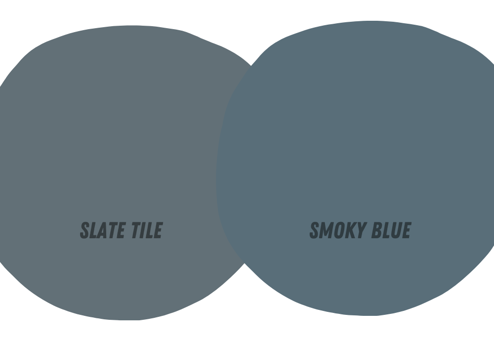
Although Sherwin Williams’ Slate Tile and Smoky Blue have subtle hints of green, Slate Tile’s green undertone is more prominent than Smoky Blue.
On the other hand, Smoky Blue has a stronger gray undertone that produces a warmer and lighter accent than Slate Tile.
Is Sherwin Williams Slate Tile Good For Kitchen Cabinets?
Yes. The semi-dark tone and strong blue color of Sherwin Williams’ Slate Tile are ideal for cabinets and other furniture.
Slate’s solid and neutral color makes the furniture and fixture stand out, especially if you pair them with walls or ceilings with light or warm colors.

