Several colors go well with Benjamin Moore Pale Oak, including neutrals like white, beige, and gray, as well as bold and bright colors like navy blue, emerald green, and mustard yellow. Blues and greens also pair well with this shade, as do blush pink and soft purples.
However, the best color combination depends on your style and the mood you want to create in your space.
What Color Is Benjamin Moore Pale Oak?
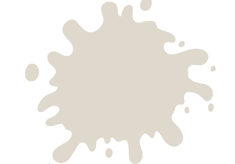
Benjamin Moore Pale Oak is a popular paint color known for its subtle warmth and versatility. It’s a chameleon-like shade that can appear gray, beige, or even blush-pink, depending on the lighting conditions.
Let us explore the color characteristics of Benjamin Moore Pale Oak in more detail.
Is Benjamin Moore Pale Oak Warm Or Cool?
Benjamin Moore Pale Oak is considered a warm color, with subtle undertones of gray and beige that give it a cozy and inviting feel.
Warm colors tend to have undertones of red, yellow, or orange and can evoke feelings of happiness, comfort, and relaxation.
In contrast, cool colors like blue, green, and purple have undertones of blue and can create a calming and soothing atmosphere.
What Undertones Does BM Pale Oak Have?
Benjamin Moore Pale Oak has undertones of gray and beige, giving it a neutral and versatile look. The gray undertones make it a great choice for those who want a cooler and more sophisticated feel, while the beige undertones give it warmth and softness.
Depending on the lighting conditions, the color can also appear slightly pinkish, which adds a subtle touch of femininity and elegance.
What Colors Go Well With Benjamin Moore Pale Oak?
Many great options exist when pairing colors with Benjamin Moore Pale Oak. By choosing colors that complement the subtle warmth and versatility of Pale Oak, you can create a beautiful and harmonious look that’s perfect for any room in your home.
Here are 5 colors that go well with this versatile and elegant color:
1. Sherwin Williams Shoji White
Shoji White is a beautiful off-white color that pairs perfectly with Pale Oak. In addition, Shoji White has a subtle warm undertone that complements the cool undertones of Pale Oak.
This combination creates a warm and inviting atmosphere that works well in any house room. Shoji White also works well with natural wood tones, making it an excellent choice for a farmhouse or rustic-style home.
2. Sherwin Williams Balanced Beige
Balanced Beige pairs well with Pale Oak. This color has a warm undertone that creates a cozy atmosphere in any room.
Balanced Beige works well with natural wood tones and metallic accents. This color combination is perfect for a formal living or dining room.
3. Behr Pink Mimosa
If you’re looking for a pop of color that complements Pale Oak, consider Behr’s Pink Mimosa. This soft pink hue is a great choice for accent walls or decor.
Pink Mimosa has a warm undertone that works well with the warm beige undertones of Pale Oak.
The two colors together create a cozy and inviting space. You can pair Pink Mimosa with other soft pastels or muted grays for a harmonious color scheme.
4. Benjamin Moore Gray Cashmere
Consider pairing Pale Oak with Benjamin Moore’s Gray Cashmere for a more muted and sophisticated look. This soft gray with a hint of blue undertones creates a soothing atmosphere in any room.
The cool tones of Gray Cashmere complement the warm undertones of Pale Oak perfectly. This color combination works well in bedrooms, bathrooms, or a cozy living room.
In addition, you can add pops of color with accent pillows, artwork, or decor in other colors, such as navy blue, emerald green, or even a soft blush pink.
5. Behr Dragonfly
If you want to create a more dramatic effect, pairing Pale Oak with Behr’s Dragonfly is an excellent choice.
This deep, moody green hue with blue undertones works beautifully with Pale Oak, creating a striking yet elegant color scheme.
You can use Dragonfly on an accent wall or as a feature color in the room’s decor. Adding gold, brass, or rose gold touches can further elevate the look.
You can also use natural textures such as rattan or woven jute to create a cozy and inviting space.
Does Pale Oak Look Pink Or Gray?
The truth is that Pale Oak has both pink and gray undertones, making it such a unique and adaptable color. Depending on the lighting and surrounding colors in the room, Pale Oak can appear to have more pink or gray tones.
Pale Oak can have a warm and pinkish hue in a well-lit room with lots of natural light. This is because the natural light brings out the pink undertones in color, creating a soft and inviting atmosphere.
Conversely, pale Oak can appear grayer in a room with cooler lighting or in a space that doesn’t receive as much natural light, with cooler undertones that add a touch of sophistication and elegance.
It’s important to note that the colors and furnishings can also influence the underlying pink or gray tones in Pale Oak in the room.
Pairing Pale Oak with warm, earthy colors like terra cotta or rust can enhance its pink tones, while pairing it with cooler colors like navy or gray can bring out its gray undertones.
What Shade Is Benjamin Moore Pale Oak?
Benjamin Moore Pale Oak is a warm and light-toned color that has become increasingly popular for its versatility and ability to work well in various spaces.
Specifically, Benjamin Moore Pale Oak is a light beige with warm undertones. In addition, it has a slightly grayish hue, giving it a soft and subtle appearance.
Depending on the lighting and surrounding colors, it can appear more beige, gray, or even slightly pinkish. This versatility makes it an excellent choice for any room in the home.
What Is the Difference Between Pale Oak And Edgecomb Gray?
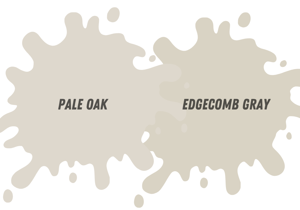
If you decide between Benjamin Moore Pale Oak and Edgecomb Gray, you might wonder about the differences between these popular paint colors.
Both are neutral, versatile colors that work well in various spaces, but there are some key differences to consider. So first, we’ll take a closer look at the differences between Pale Oak and Edgecomb Gray.
Does Edgecomb Gray Go With Pale Oak?
Pale Oak and Edgecomb Gray are often used together in a space to create a cohesive and elegant look. These two colors are very similar in tone, so they complement each other well.
Edgecomb Gray is slightly cooler than Pale Oak, but the difference is subtle and can enhance the overall look of a room when used together.
When using these two colors together, there are a few things to remember. First, you’ll want to ensure that each color’s undertones are compatible. For example, pale Oak and Edgecomb Gray work well with warm undertones.
Second, consider the balance of the colors in the space. You can use one color as the primary wall color and the other as an accent, or you can use both colors in equal amounts throughout the space.
Is Pale Oak And Collingwood Very Similar Colors?
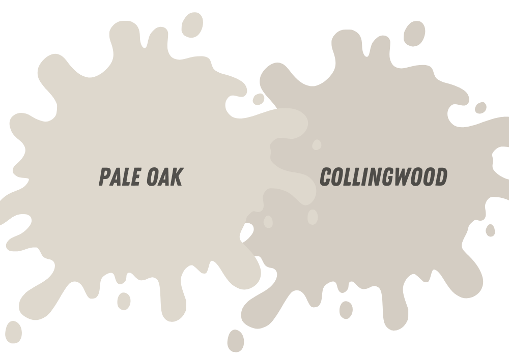
While both colors fall into the category of “greige” (a mix of gray and beige), there are some key differences to consider.
First, let’s take a closer look at Benjamin Moore Pale Oak. This light and airy color has warm undertones that sometimes appear pink or peach in certain lighting conditions.
However, it has a neutral quality making it a popular choice for interior walls, particularly in living rooms, bedrooms, and bathrooms—pale Oak pairs well with various accent colors, including shades of blue, green, and gray.
Now, let’s examine Benjamin Moore Collingwood. This color is slightly darker and cooler than Pale Oak, with a subtle gray undertone.
It has a more modern and sophisticated feel than Pale Oak and is often used in contemporary interiors — Collingwood pairs well with crisp white trim and black or charcoal gray pops.
What Is the Difference Between Pale Oak And Balboa Mist?
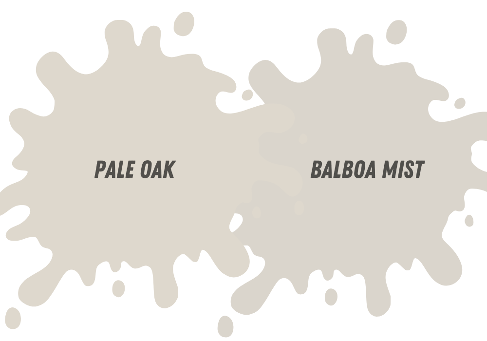
The differences between these two colors may seem subtle, but they can significantly impact the overall feel of a space. Pale Oak is a light, warm gray color with a slight beige undertone.
It is a versatile color that works well in various areas, from bedrooms to living rooms to kitchens.
Its warm undertones make it an excellent choice for creating a cozy and inviting atmosphere. Pale Oak also has a hint of pink, making it a perfect match for wood finishes with a pinkish hue.
Balboa Mist is a cooler, neutral gray color. It has subtle purple undertones give it a cooler feel than Pale Oak. Balboa Mist works well in spaces with plenty of natural light, as it can appear darker in dimly lit rooms. Balboa Mist is famous for creating a modern look.
Classic Gray Vs. Pale Oak
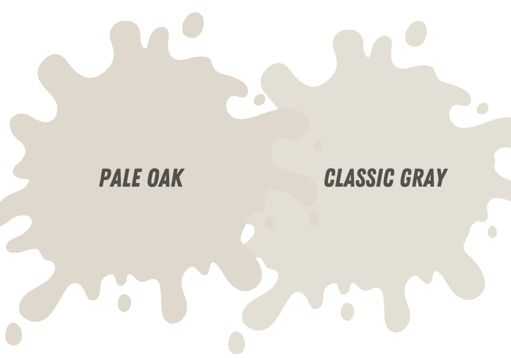
Pale Oak and Classic Gray are two of the most popular paint colors from Benjamin Moore. Both of these colors are versatile and can be used in various settings.
However, some key differences between the two colors make them suitable for different situations.
Is Classic Gray Lighter Than Pale Oak?
When it comes to color intensity, Classic Gray is lighter than Pale Oak. Classic Gray has an LRV of 74.93, while Pale Oak has an LRV of 69.89.
This means that Classic Gray reflects more light than Pale Oak and appears lighter in a space. However, it is important to note that both colors are soft neutrals with similar brightness levels.
In terms of undertones, Classic Gray has cool undertones, while Pale Oak has warm undertones. Classic Gray’s blue-green undertone can give it a slightly excellent, almost silvery appearance in certain lighting conditions.
Pale Oak, on the other hand, has a pink-beige undertone that can give it a warm, earthy feel.
Pale Oak Vs. Swiss Coffee
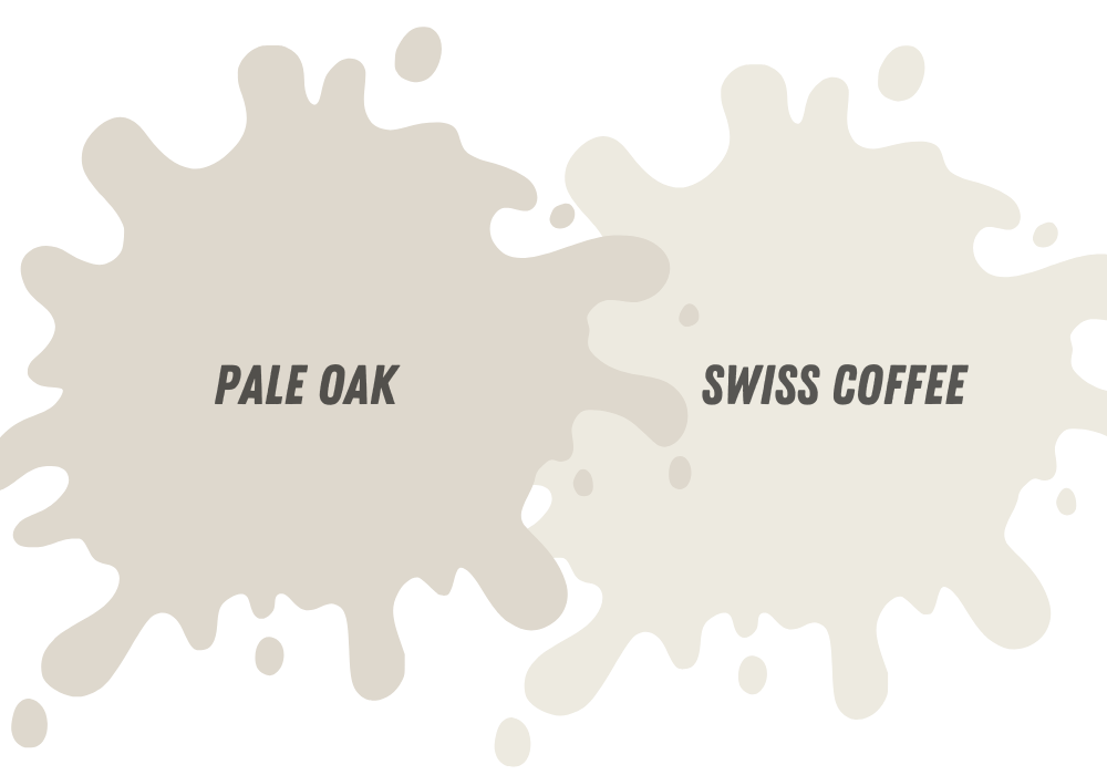
When choosing the right paint color, many homeowners get overwhelmed with the options. Benjamin Moore’s Pale Oak and Swiss Coffee are two popular shades often compared.
While both are light neutrals, they have subtle differences that can affect a room’s overall look and feel.
Is Pale Oak Darker Than Swiss Coffee?
One of the most noticeable differences between Pale Oak and Swiss Coffee is their level of darkness. Pale Oak is a lighter shade of neutral beige with a warm undertone.
It has an LRV of 69.89, reflecting more light and making a space appear brighter and larger. On the other hand, Swiss Coffee has a slightly darker hue with an LRV of 83.93. It is still considered light but has more depth than Pale Oak.
When deciding which color to use, it’s essential to consider the amount of natural light the room receives. If the space has limited natural light, Pale Oak can help make the area appear brighter and more open.
On the other hand, if the space gets plenty of natural light, Swiss Coffee can add warmth and depth to the room without overpowering it.
Does Swiss Coffee Go With Pale Oak?
Coffee and Pale Oak can complement each other beautifully in the same room. Both colors are neutrals, creating a harmonious color palette.
To achieve the best results when using these two colors together, it’s essential to consider the undertones of each color. Pale Oak has a warm undertone, while Swiss Coffee has a slight yellow undertone.
Pair Pale Oak with warm accent colors like coral, peach, and goldenrod to create a cohesive look. For Swiss Coffee, consider pairing it with cool accent colors like blue-gray, navy, and emerald green.
In a living room, you could use Pale Oak on the walls and Swiss Coffee on the trim and doors. You could add a coral accent chair and goldenrod throw pillows to create a warm and inviting atmosphere.
Or, in a bedroom, you could use Swiss Coffee on the walls and Pale Oak on the ceiling. You could add navy blue bedding and emerald green curtains for a fresh and elegant look.

