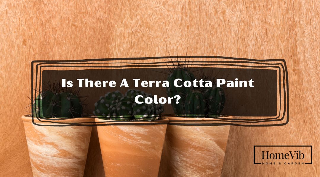
Yes, there is a terra cotta paint color. Terra cotta is a warm, earthy color that ranges from yellowish-brown to reddish-orange. It is often associated with Mediterranean and Southwestern architecture and is a popular choice for interior design.
There are several terra cotta paint colors available from different paint brands. When choosing a terra cotta paint color, consider the other colors in your decor and the amount of natural light in the room.
What Color Is Terra Cotta Paint?

Terra cotta paint is a warm, earthy color that can add a cozy and inviting feel to any space. It gets its name from the Italian words “terra” (earth) and “cotta” (cooked), as it resembles the color of baked clay.
The exact shade of terra cotta can vary depending on the paint brand and the pigment used. Some terra cotta paints may have more yellow undertones, while others may have more orange or red undertones.
It’s important to choose a terra cotta paint color that complements the other colors in your decor and fits the overall style of your space.
In rooms with ample natural light, terra cotta paint can appear more vibrant and saturated. In darker rooms, it can look more muted and subdued.
It is crucial to consider the lighting in the room when choosing a terra cotta paint color to ensure that you achieve the desired effect.
6 Most Popular Terra Cotta Paint Colors
If you want to add a touch of warmth and coziness to your home, terra cotta paint is a great option. Terra cotta paint is available in many shades and variations, each with its unique personality and charm.
In this article, we’ll explore the six most popular terra cotta paint colors from top paint brands and provide the information you need to choose the perfect color for your space.
These six terra cotta paint colors are some of the most popular options from top paint brands. Whether you’re looking for a bold and daring shade
1. Sherwin Williams Cavern Clay
Sherwin Williams’ Cavern Clay is a rich, warm terra cotta color inspired by the American Southwest. This bold shade has solid orange undertones that make it stand out in any room.
Cavern Clay pairs well with warm colors like deep browns and tans and cooler blues and greens. This versatile color can be used as an accent wall or as the primary color in a room.
2. Benjamin Moore Spiced Apple Cider
Benjamin Moore’s Spiced Apple Cider is a soft, muted terra cotta color perfect for creating a cozy and inviting atmosphere.
This shade has subtle pink and brown undertones giving it a unique, earthy feel—spiced Apple Cider pairs well with other warm colors like deep greens and blues and cool grays and whites.
This color is an excellent option for bedrooms, living rooms, and other spaces where you want to create a relaxing and serene environment.
3. Benjamin Moore Terra Cotta Tile
Benjamin Moore’s Terra Cotta Tile is a classic terra cotta color that is warm and inviting. This shade has solid red and orange undertones, perfect for creating a bold statement in any room.
Terra Cotta Tile pairs well with other warm colors like deep browns and tans and cooler greens and blues. This color is an excellent option for dining rooms, kitchens, and other spaces where you want to create a warm and welcoming environment.
4. Sherwin Williams Persimmon
Sherwin Williams’ Persimmon is a bright and bold terra cotta color perfect for creating a statement in any room. This shade has solid red and orange undertones, making it an excellent option for accent walls or bold, daring rooms.
Persimmon pairs well with warm colors like deep browns and tans and cooler blues and greens. This color is a great option for living rooms, home offices, and other spaces where you want to create a bold and daring environment.
5. Benjamin Moore Terra Mauve
Benjamin Moore’s Terra Mauve is a soft, muted terra cotta color with subtle pink and brown undertones. This shade creates a cozy and inviting atmosphere in any space.
Terra Mauve pairs well with other warm colors like deep greens and blues, as well as cool grays and whites. This color is a great option for bedrooms, bathrooms, and other spaces where you want to create a relaxing and serene environment.
6. Behr Warm Terra Cotta (PMD-11)
Behr’s Warm Terra Cotta (PMD-11) is a rich, warm terra cotta color with strong orange undertones. This shade is perfect for creating a bold and inviting atmosphere in any room.
Warm Terra Cotta pairs well with warm colors like deep browns and tans and cooler blues and greens. This color is a great option for accent walls, kitchens, and other spaces where you want to create a bold and daring environment.
What Color Goes With Terra Cotta?
Terra cotta is a versatile color that can work well in various design styles. It is warm, earthy, and rich, making it an excellent choice for creating a cozy and inviting atmosphere.
If you’re wondering what colors to pair with terra cotta, here are some ideas to get you started:
1. Benjamin Moore’s Soft Fern 2144-40
A soft, muted sage green like Benjamin Moore’s Soft Fern 2144-40 perfectly complements terra cotta—the muted green tones down the intensity of the terra cotta, creating a calming and inviting space.
This color combination works well in bedrooms, living rooms, and outdoor areas like patios and decks.
2. Sherwin Williams’ Naval SW 6244
If you’re looking for a bold and dramatic color pairing, try pairing terra cotta with Sherwin Williams’ Naval SW 6244, a deep navy blue.
The rich, dark blue color adds depth and contrasts to the warm, earthy terra cotta. This combination works well in modern or industrial-style spaces and bohemian or eclectic designs.
3. Behr’s Pink Mimosa T18-05
Soft pink is a surprisingly beautiful color to pair with terra cotta. Behr’s Pink Mimosa T18-05 is a subtly pink tone that adds a touch of femininity and elegance to the warm, earthy terra cotta.
This color combination works well in bedrooms, bathrooms, and bohemian or eclectic designs.
4. Benjamin Moore’s Spicy Mustard 2154-20
This warm and spicy yellow hue complements the earthy tones of terra cotta beautifully, creating a warm and inviting space. This color combination can be used in various rooms, including living rooms, dining rooms, and home offices.
The Spicy Mustard color adds a cheerful and playful element to the space, while the terra cotta creates a cozy and intimate atmosphere.
5. Behr’s River Rock N280-4
For those who prefer a more subdued and neutral color scheme, pairing terra cotta with a muted gray-green shade such as Behr’s River Rock N280-4 is perfect.
This soft and muted green-gray hue beautifully complements terra cotta’s warm and earthy tones without overpowering them. This color combination works exceptionally well in various home areas, including bathrooms, kitchens, and bedrooms.
The softness of the gray-green color can bring a calming effect to the space, while the terra cotta adds a touch of warmth and richness.
Is Terra Cotta a Warm Or Cool Color?
Terra cotta has warm orange undertones, contributing to its overall warmth. These warm undertones make it a great color choice for cozy and welcoming rooms, like bedrooms and living rooms.
While terra cotta is generally considered a warm color, it can also be combined with cooler colors for a balanced look.
Pairing terra cotta with cool, muted blues or greens can create a calming and soothing color palette, while pairing it with warm yellows or oranges can create a vibrant and energetic space.
When selecting a terra cotta paint color, it’s important to consider the other colors in the room and how they will interact with the warm tones of the terra cotta.
Complementary colors can create a cohesive and balanced look. For example, pairing terra cotta with deep, rich browns or muted greens can create a natural, earthy color palette.
What Color Is the Opposite Of Terra Cotta On Color Wheel?
If you’re looking for a color that contrasts with terra cotta, you’ll want to look for one that falls on the opposite side of the wheel. Colors opposite on the color wheel are called complementary colors, creating a striking contrast when paired together.
The opposite of terra cotta on the color wheel is a blue-green shade. Specifically, the complementary color for terra cotta is a color that falls between green and blue on the color wheel. This color can range from a deep teal or turquoise to a lighter, more muted blue-green.
Pairing terra cotta with its complementary color creates a bold, eye-catching combination that can be used in various settings.
For example, a living room with terra cotta walls might be accented with throw pillows, curtains, or rugs in a complementary shade of blue-green. Similarly, a kitchen with terra cotta tiles might be balanced with blue-green cabinets or countertops.
It’s worth noting that there are many shades of blue-green to choose from, and the specific shade you choose will affect the overall look and feel of your color scheme. Opt for a bright, saturated blue-green shade for a bold, high-contrast look. Choose a softer, more muted shade for a more subtle, calming look.
When selecting colors for your decor, it’s essential to consider the mood and atmosphere you want to create in your space. While terra cotta and blue-green create a bold contrast, they can also be balanced with neutral colors like beige, gray, or white to create a more calming and balanced color palette.
Is Terra Cotta Color In Style?
Terra cotta has been used in design for centuries. Its natural and inviting tones make it a versatile color in various styles and settings. But is terra cotta color still in class today?
The answer is yes! Terra cotta has been coming back in recent years, and it’s easy to see why. Its warm, reddish-brown tones evoke comfort, warmth, and coziness. It’s a color that is both timeless and trendy, making it an excellent choice for any design style.
One reason for the resurgence of terra cotta is the growing popularity of natural and organic materials in interior design. Terra cotta is a raw clay material that has been used for centuries in pottery and architecture, and its warm, earthy tones bring a sense of grounding and connection to the natural world.
Terra cotta can be used as a bold accent or neutral base color. It pairs well with warm colors like mustard yellow, olive green, and burnt orange and cooler tones like blues and greens.
Terra cotta is also an excellent choice for a variety of design styles. It works well in rustic and bohemian interiors, where natural materials and warm colors create a cozy, lived-in atmosphere.
But it can also be used in modern and minimalist spaces, where its warm tones can add depth and texture to an otherwise neutral palette.