Whether you’re painting your whole house or just a single wall in one room, charcoal gray is an excellent choice. You can mix up the color palette by choosing shades of gray for different parts of your home.
Charcoal gray is an elegant, sophisticated color in any interior space. It’s a neutral shade that works well with almost any decorating style.
Consider adding charcoal gray to your design scheme if you want a new look for your home or office. You’ll be able to create a sophisticated and glamorous space that will make a statement on its own!
The most popular charcoal gray paint colors are Chelsea Gray and Steel Wool by Benjamin Moore. You can also choose from Sherwin-Williams’ Dovetail and Iron Ore.
Try adding some pops of color from Kelly Moore’s Volcanic Rock and Subway. If you want a modern and minimalistic look, go for Behr’s Graphic Charcoal and Calligraphy.
What Color Is Charcoal Gray Paint?
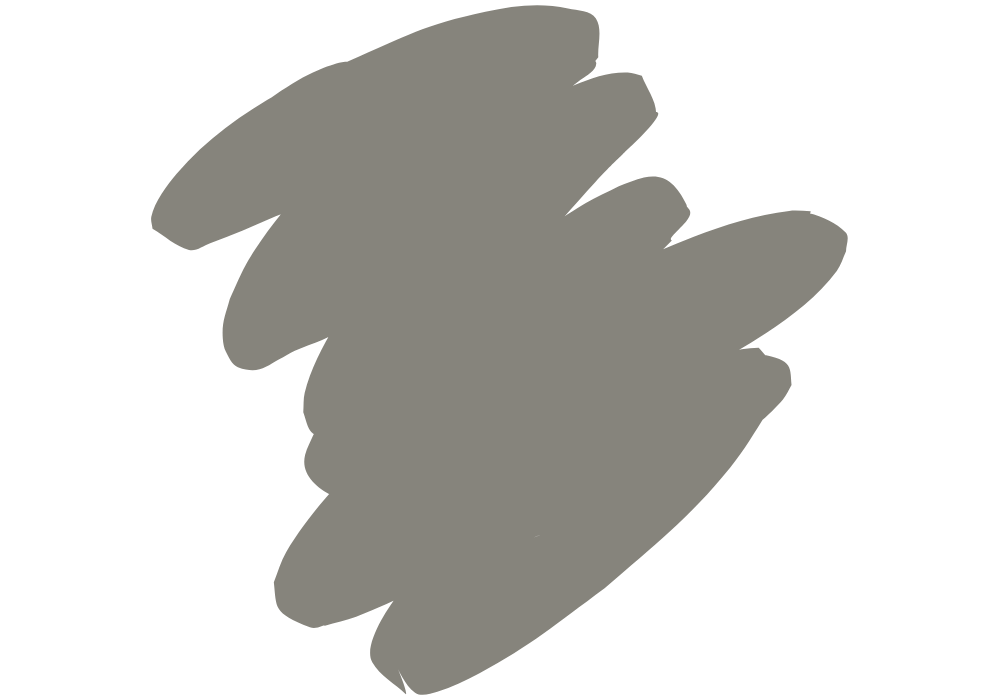
Charcoal gray combines black and white, but its dark tone is nearly as dramatic as pure black.
Charcoal is one of the most adaptable hues, which should not be mistaken for gray. Charcoal, unlike gray, incorporates a small amount of blue into the mix.
On the technical side, Charcoal has the hex code #36454F. It contains 21.2 % red, 27.1 % green, and 31 % blue. You can see it from the color space that uses the RGB color model. These consist of three different colored lights red, green, and blue.
Charcoal gray is a versatile neutral that you can use to look warm or cold. It will depend on the lighting and the surrounding colors. Designing with daring tones might be scary. However, charcoal gray is versatile enough to work with almost any aesthetic.
Overall, Charcoal is an ideal addition to almost any color scheme. It always complements a wide range of bright colors. It is also most effective when used to amplify a primary accent hue.
Is Charcoal Gray Light Or Dark?
On the color scale, charcoal gray is the darkest tone. It’s nearly black. Yet substantially brighter, so how it appears relies mostly on the lighting.
Charcoal gray is a neutral color that goes with anything. However, this shade is a clean mix of black and white.
Depending on the temperature of the light source, the dark gray color may contain cool undertones of blue and green. If you place it near mauve, or warm undertones of pink, yellow, or green, it also cools down the space.
Charcoal is also known as graphite and anthracite colors. Many people equate this dark color with real coal, whether wood-burning or dug from the earth.
Pairing Charcoal gray with warm undertones of green, brown, or violet provides a cozy color. At the same time, using a dark gray with hints of purple and blue will appear cool.
15 Popular Charcoal Gray Paint Colors
Charcoal gray can work in any space, from bedrooms to living rooms, kitchens to halls. It’s neutral enough to fit into almost any decorating scheme. And still bold enough to make a statement.
And if you’re looking for a little extra pizzazz? Try adding some pops of color!
Let us identify each design from paint suppliers.
1. Benjamin Moore’s Chelsea Gray
Chelsea Gray is by far the most well-known among Benjamin Moore’s dark grays.
The brownish violet tones in Chelsea Gray set it apart. When coupled with cooler paint colors, the purple undertones reflect intensely.
The greenish undertone provides a warmer exterior impression depending on how the sun hits it. It also complements warm colors like coral, copper, pink, and red.
2. Benjamin Moore’s Steel Wool
As opposed to Chelsea Gray, Steel Wool flows in the reverse direction.
Steel Wool is a cool gray paint color with a violet-blue undertone. At the same time, Chelsea Gray is a warm gray with a hint of green.
One of Steel Wool’s best qualities is you can use it to indicate interest in either the blue or violet spectrums. That is without fully committing to each shade. And it also accomplishes all of these while maintaining a gray appearance.
3. Benjamin Moore’s Trout Gray
Trout Gray is a charcoal gray color that leans slightly toward the blue side.
Trout Gray is subjectively neither black nor white. However, its bluish-violet undertone is rather obvious. Then makes it look less like a true gray than the shade itself.
You can blend it with BM’s Chantilly Lace which is very white, making them a great contrast against Trout Gray.
4. Benjamin Moore’s Kendall Charcoal
Kendall Charcoal is a dark, rich gray with a bit of green for organic warmth.
The green undertones make it a great choice for rooms bathed in cool, gray light.
Kendall Charcoal by BM is also great for a dark living room with many windows. Use natural wood tones to maintain a calming color scheme.
5. Benjamin Moore’s Dolphin
It’s no secret that Benjamin Moore’s Dolphin is a favorite color among homeowners.
You can observe a very slight hint of green in Benjamin Moore’s Dolphin. It’s a sophisticated gray that can either take center stage or blend into the background.
A timeless classic, Dolphin is a warm gray from BM’s Affinity Color Collection.
6. Sherwin Williams’ Dovetail
Dovetail is an inviting gray that blends easily with others.
Although the dovetail is gray, its brown overtones make it seem more welcoming. It’s important to keep in mind, though, that complexities are just a matter of perspective.
Dovetail can appear a little more like a conventional gray in north-facing light. However, it will still reflect an understated warmth.
7. Sherwin Williams’ Iron Ore
Sherwin-Williams Iron Ore is an almost invisible shade of greenish black.
You can apply it on both interior and exterior settings. Iron ore looks dark gray when applied in a warm palette with white trim and warm light wood.
Additionally, you can’t go wrong with any color from the yellow or green family when you’re working with Iron Ore.
8. Sherwin Williams’ Web Gray
Web Gray leans BLUE, but it’s a fairly neutral blue that can work with any shade.
Although it is technically a blue-green, it can take on a bluish hue when paired with a greener shade.
This neutral color is dark and sophisticated. Because of its deep charcoal undertones, it is perfect for cognac feathers, as the photo shows.
9. Sherwin Williams’ Peppercorn
Peppercorn by Sherwin-Williams is the darkest option here.
Some may even consider it to be black. Under the correct lighting conditions, peppercorn looks like very dark charcoal.
If you plan on painting a room that gets a lot of natural light, the peppercorn color will come across as striking deep charcoal.
Peppercorn is commonly considered a “true gray” because it has a single undertone.
10. Sherwin Williams’ Grizzle Gray
Regarding gray paint, Grizzle Gray is one of the dark options. Charcoal is a common term for colors used at this depth.
You must pick the right complementary hues to complement this kind of shade.
SW Grizzle Gray shines next to cherry red, taupe, and beige. As well as pure white and mustard.
11. Behr’s Graphic Charcoal
Behr’s Graphic Charcoal’s slight blue undertone complements muted, neutral tones.
You may be extremely scared to paint with bright colors. But this gray complements several interior design schemes.
The image shows this charcoal wall would look great with warm accents. It is best to place it near woven baskets and plush throw cushions.
12. Behr’s Calligraphy
You can achieve an extremely dark space by painting the walls a cool gray like Graphic Charcoal.
Behr’s Graphic Charcoal is an excellent choice for accent walls. Its dramatic yet refined appearance can also enhance a full-room paint job.
It can look charcoal gray on the walls. However, it depends on the lighting, the other colors in the space, and the time of day.
13. Behr’s Astronomical
In Behr’s palette, this dark gray Astronomical is widely known as “shadow color.”
It’s intriguing to walk into space at different times of the day because of how the color shifts as the light does.
It’s the perfect addition to any space, adding warmth and style. This shade makes you want to get cozy by the fireplace. This deep, murky hue hints at even darker tones underneath.
14. Kelly-Moore’s Volcanic Rock
If you want to add some earth tones to your home, go no further than Kelly-Volcanic Moore’s Rock.
This dark grey tint will help to neutralize the outside or inside of your home. It’s a natural brown, so it’ll fit in with the trees and bushes around it.
The image clearly shows how the house’s exterior stands out against the blend of white paint.
15. Kelly-Moore’s Subway
Kelly-Moore Subway is a sophisticated take on the standard earthy grey.
This makes it an excellent choice for those who want an organic aesthetic in their living spaces. It is an earthy color that can help you feel more connected to the natural world.
The lasting components of this rich gray will give your walls an antiquity vibe. It will also look great for years to come.
What Colors Go With Charcoal Gray?
Charcoal gray pairs well with shades like blue, purple, white, and green families. If you like the simplicity of black and white but want to add depth and visual intrigue, try using this shade of grey. You might also use bright colors like pink, yellow, or orange to set off the chilly gray tones.
To top it all off, charcoal gray complements various color palettes. The trim should be white or off-white with most grays.
In most cases, pastel colors look great with dark gray. For a sophisticated look, try mixing warmer charcoal with delicate pink. The key is to incorporate a few delicate white tones to create harmony.
Is Charcoal Gray a Warm Or Cool Color?
Charcoal gray is neither warm nor cool in the shade. It will depend on the undertones.
Which is why it will depend on the surrounding lighting. At the same time, it will also rely on the type of furnishings. As you can see, charcoal gray can come across as either a chilly or warm neutral.
Always remember that Charcoal gray is a versatile color. You can use it to complement several decor schemes.
To be sure, it’s one of the most adaptable hues around. Investing in charcoal gray paints is a good idea if you want your home’s inside and exterior to look good together.
Tips For Picking The Right Charcoal Gray Paint Color
Combining colors that go with charcoal gray is easy. To begin, locate the complementary undertone. The next step is to find the ideal light source. Next, you’ll want to look at the room’s decor and furniture. Last but not least, embrace dark tones.
Tip No. 1. Choose the Correct Undertone
Choose a paint color that is closer in an undertone to the one you want to use. Evaluate by looking at the room next to the one you intend to paint.
Tip No. 2. Look Into Your Lighting Spaces
Assessing the light in a room might help you reduce your gray paint color selections. Keep in mind light restricts in north-facing rooms. Meanwhile, warmer shades of gray also work well in west-facing rooms.
Tip No. 3. Evaluate The Space
We recommend charcoal gray with richer brown undertones. This is specifically for living rooms and master bedrooms.
Tip No. 4. Be Bold To Go Dark
Charcoal gray walls in the home could be a bold choice. Indeed, it is. Contrary to popular belief, a dark tone can be neutral and valuable. Remember that Charcoal gray can expand and enrich space.

